Boobgie
Honduras’ first bra fitting store, dedicated to helping women find their true bra size. Offering a wide range of sizes beyond standard retail options; designed for comfort, support, and confidence.
Client—The Bra Guru
Services—Branding & Packaging
Industry—Lingerie & Intimate Apparel
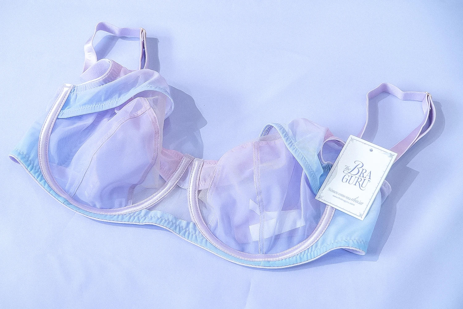
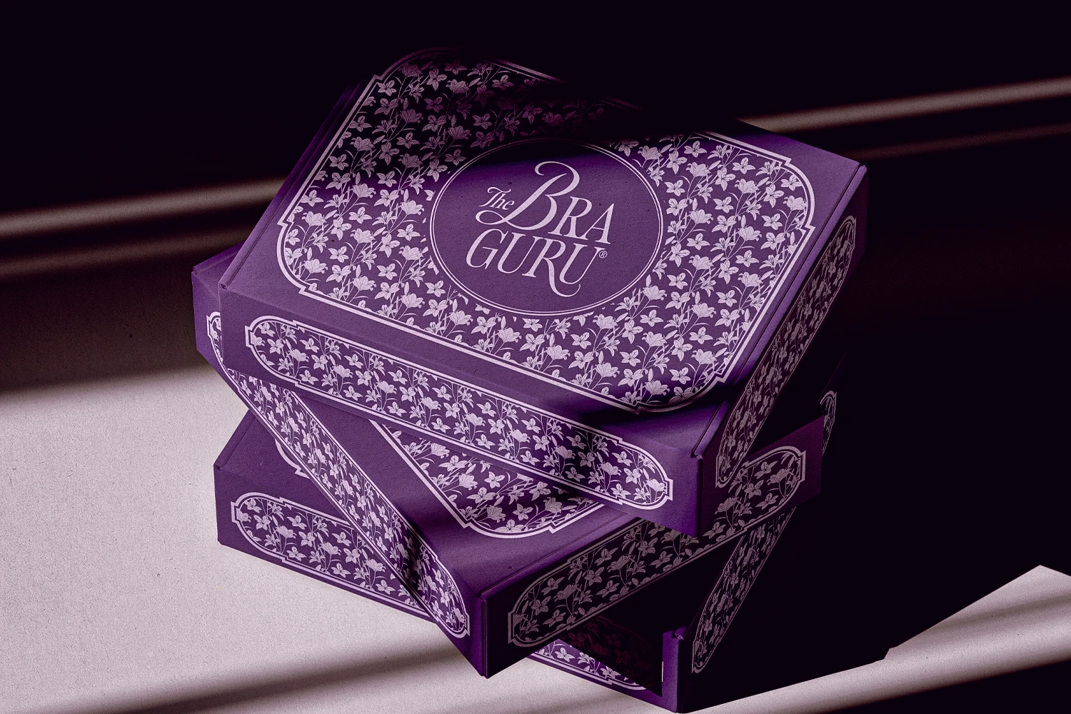
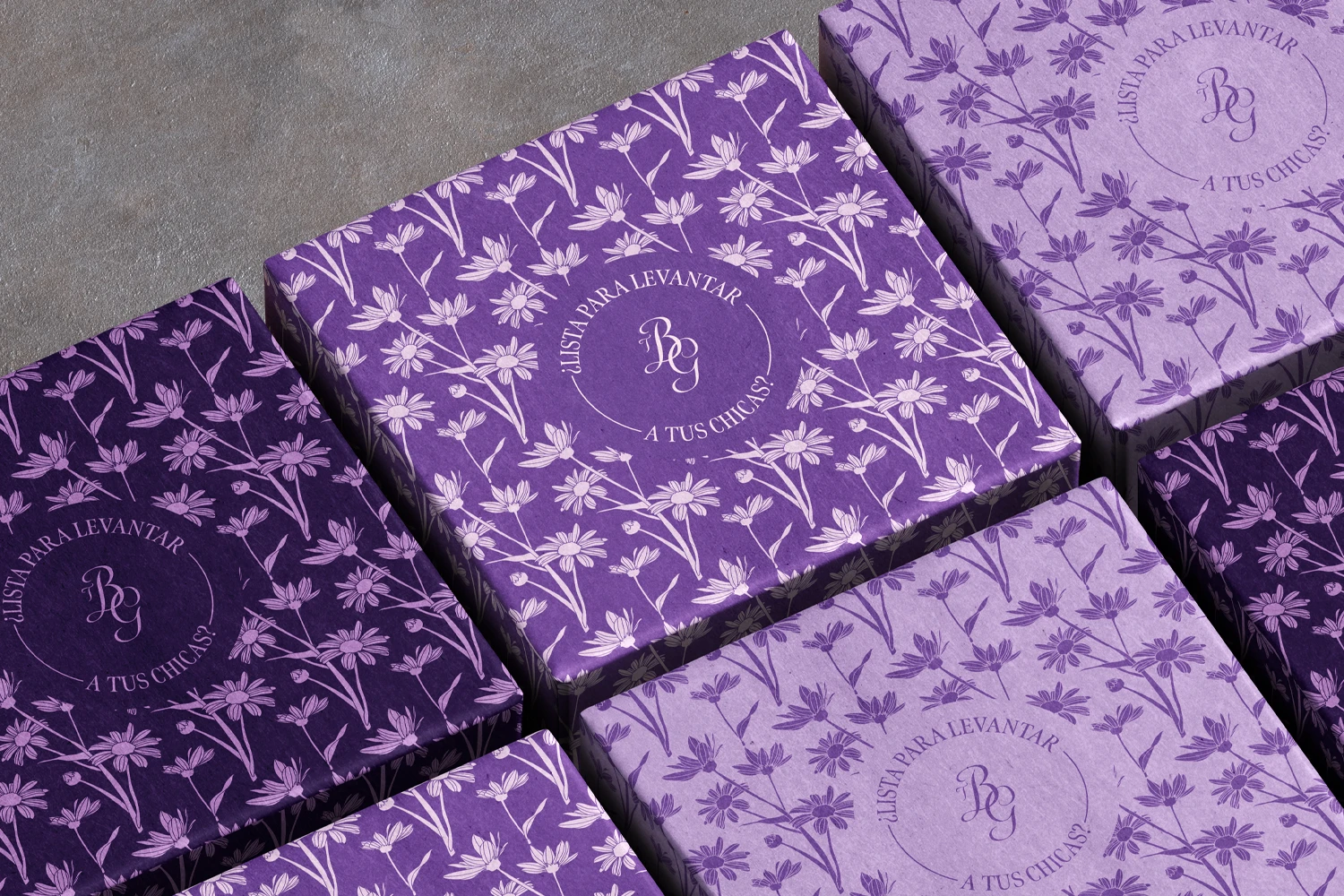
As inspired by the floral elements of Art Nouveau, we created a variety of flowers with a variety of colors. Each can be used in different ways to adorn the brand.
As inspired by the floral elements of Art Nouveau, we created a variety of flowers with a variety of colors. Each can be used in different ways to adorn the brand.
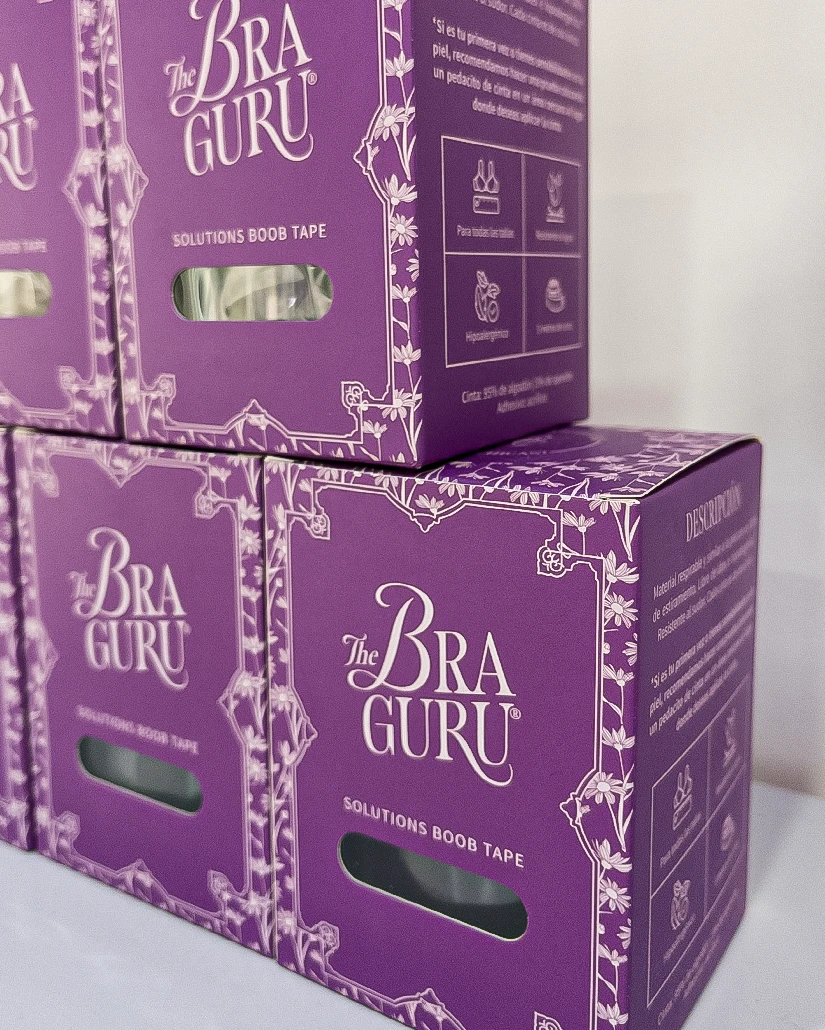
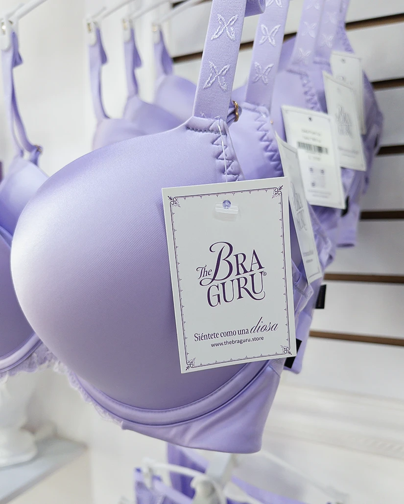
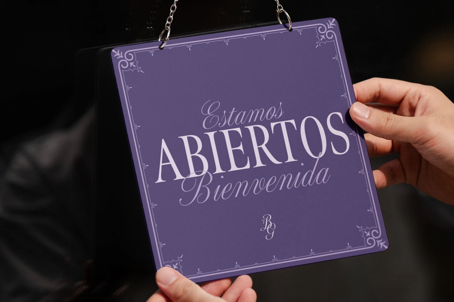
Given that the brand already uses flowers as decoration, choosing its colors from flowers was a no-brainer.
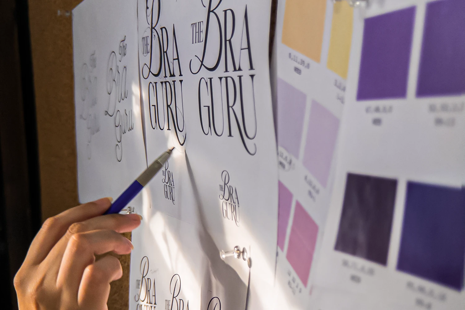
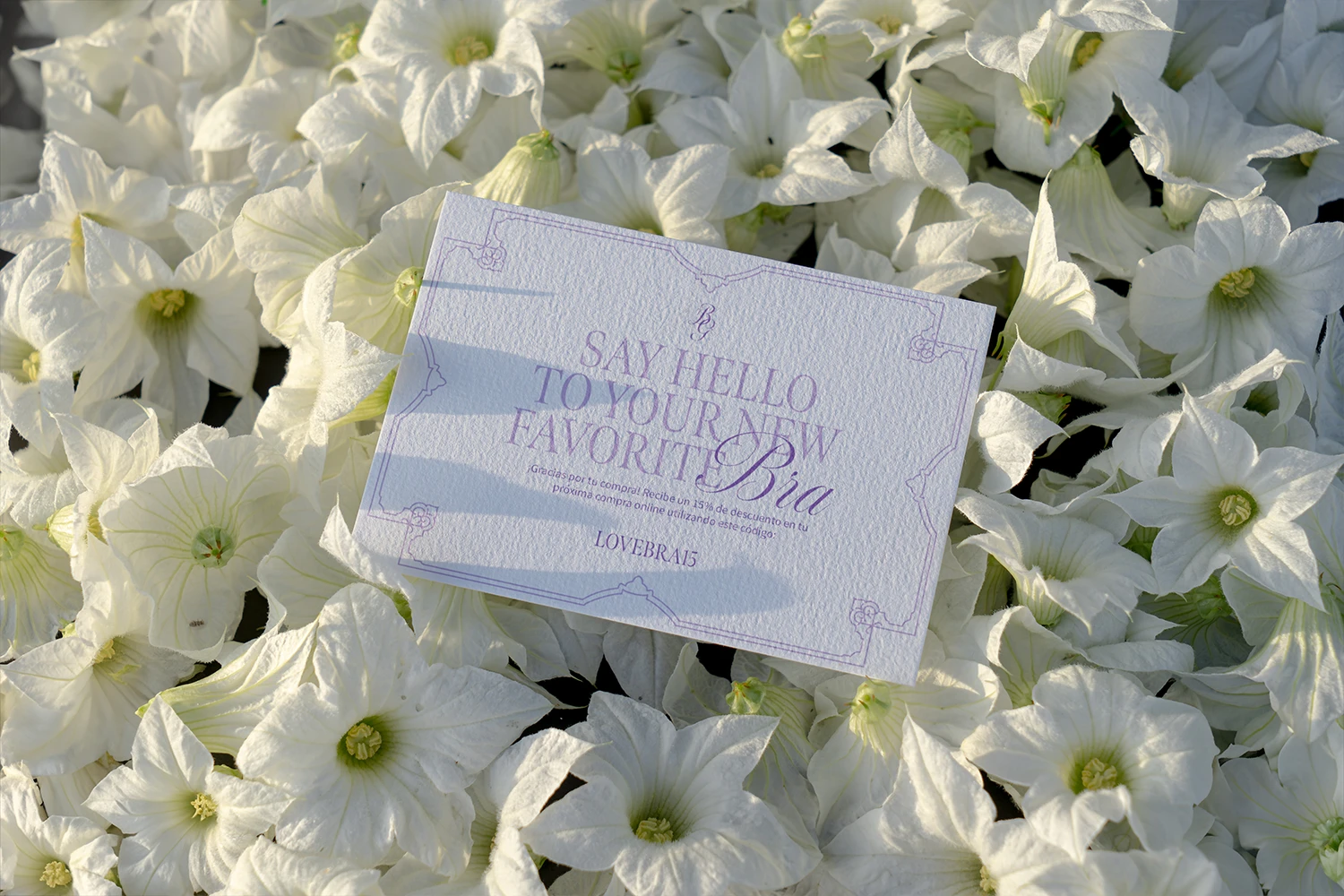
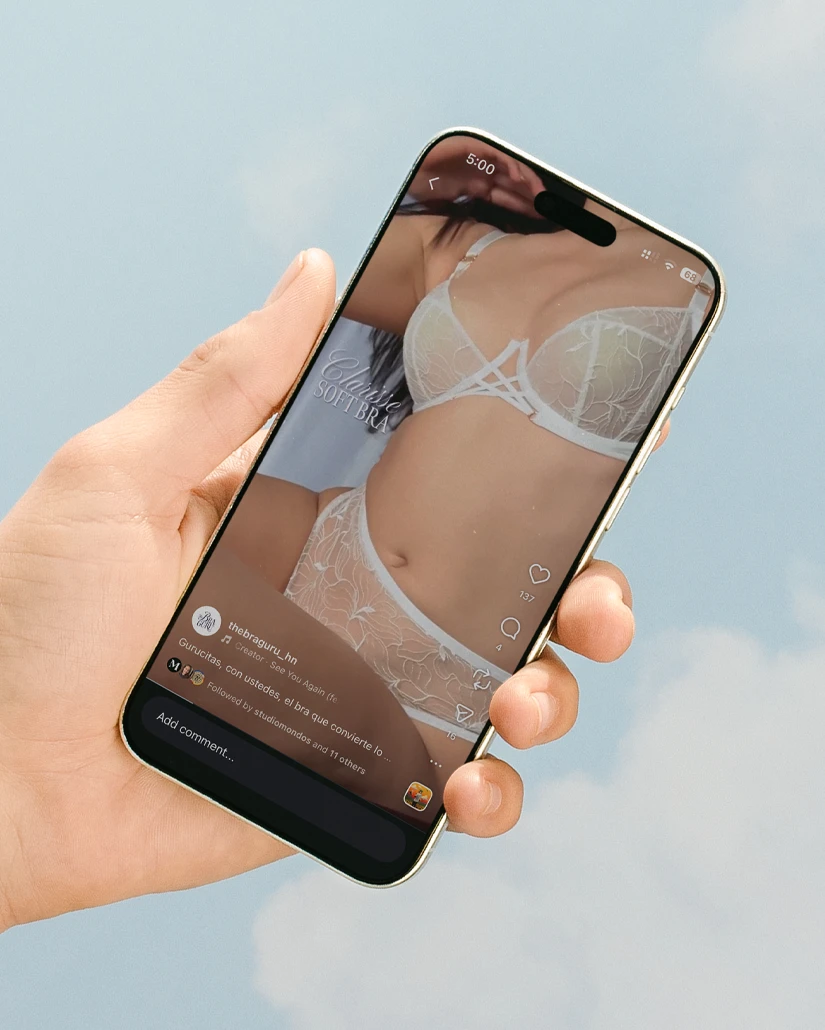
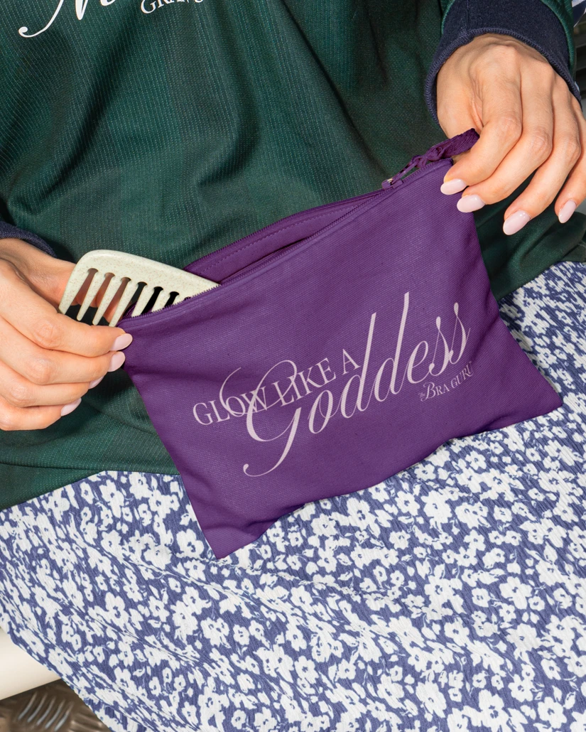
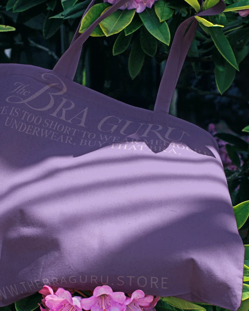
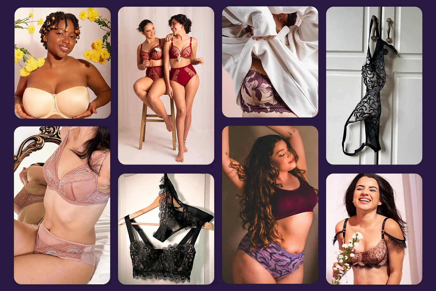
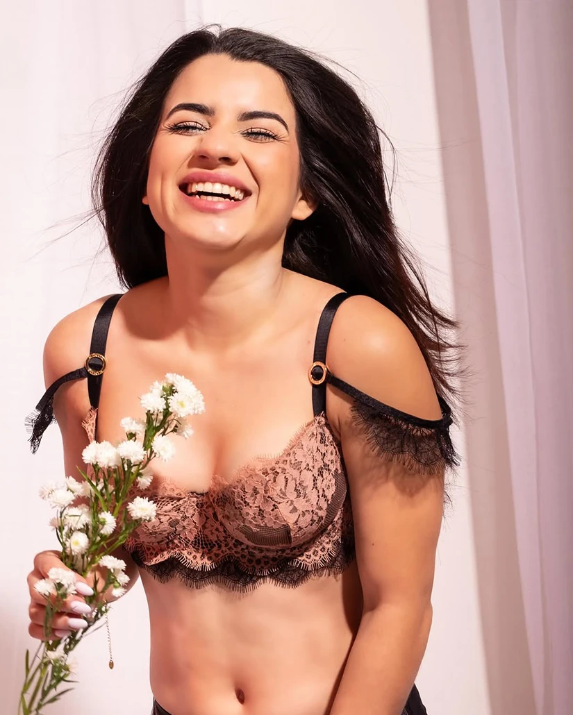
We also worked on the photographic style for their photoshoots. We aimed for an ethereal and glowy mood using natural movement and tying everything with flowers.
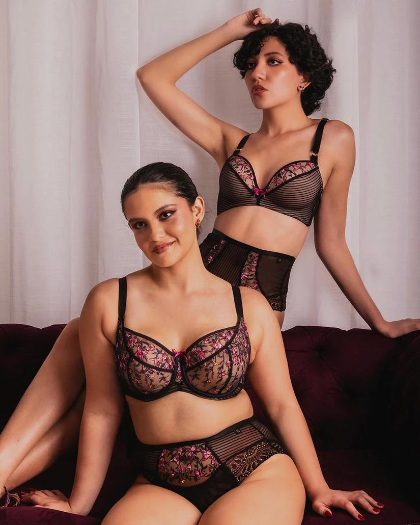
We also worked on the photographic style for their photoshoots. We aimed for an ethereal and glowy mood using natural movement and tying everything with flowers.
Project Information
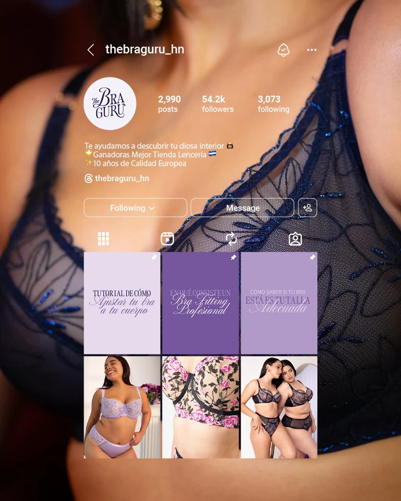
Most women are wearing the wrong size bra and that is a fact. The Bra Guru® is the first and only professional bra-fitting store in Honduras. Founded in 2015, they have now opened a total of four stores and an online shop. Their mission is to help women find comfort and support in their bras and in themselves. They offer more than 200 bra sizes and with their in-store and virtual assistance, their clients have been able to find their perfect bra. Hating bras is now a thing of the past.
Challenge: Ana came to us looking for brand uniformity but left with a full glow-up ✨. She was looking to organize her brand image since she felt that the brand was a little all over the place. She wanted our help defining the brand's colors, typefaces, and elements. She also wanted the brand to represent the high-quality undergarments she offers without making it look inaccessible. She wanted to attract, help, and educate more women and listen to them and their problems.
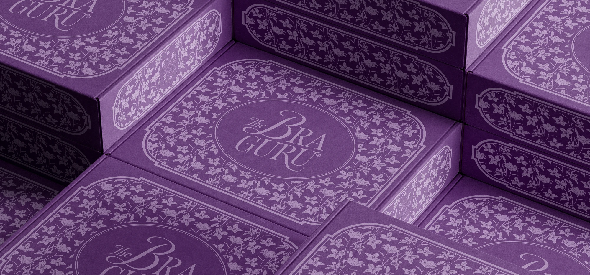
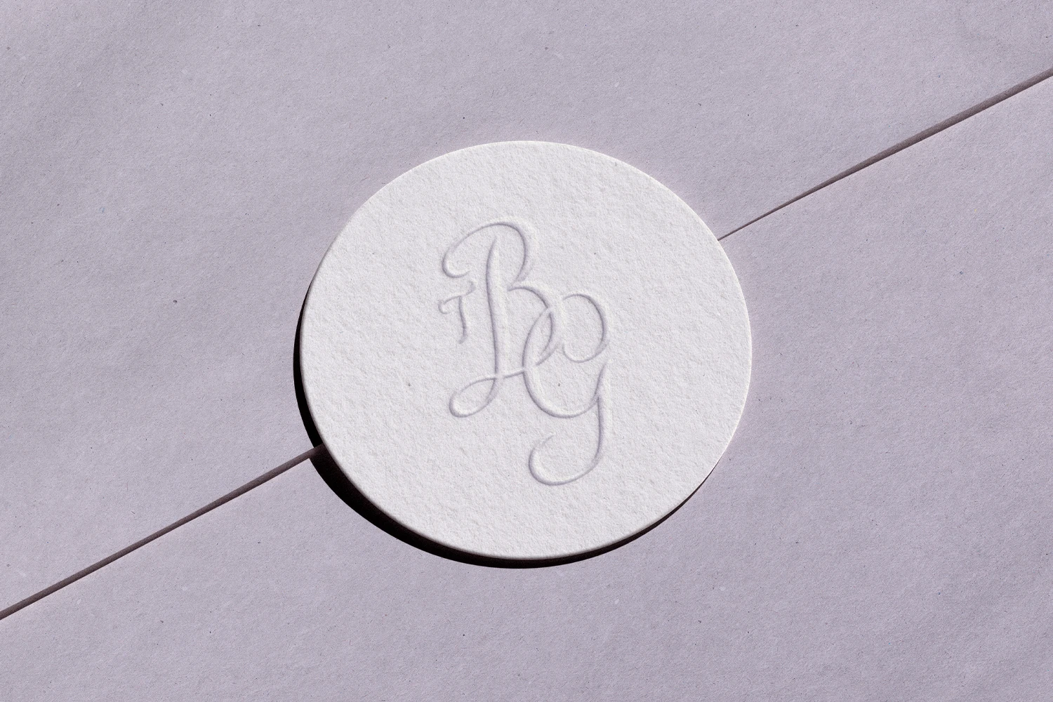
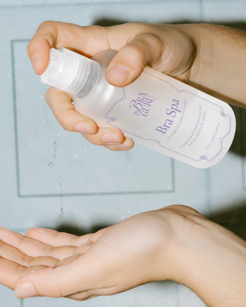
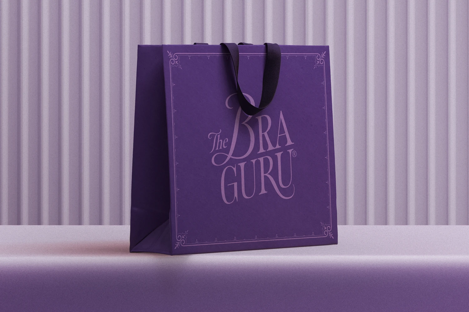
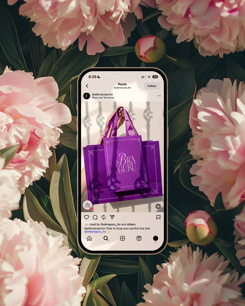
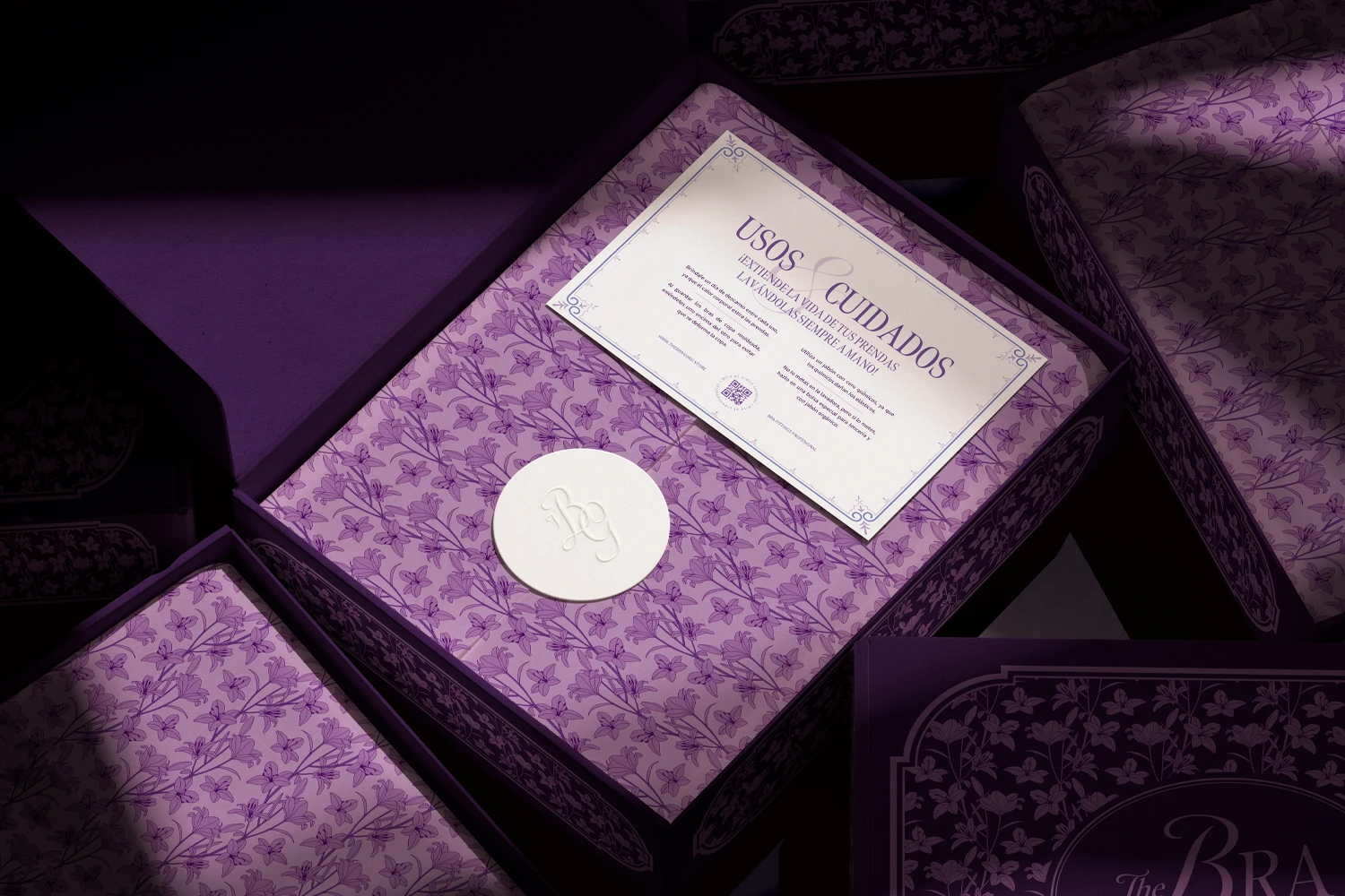
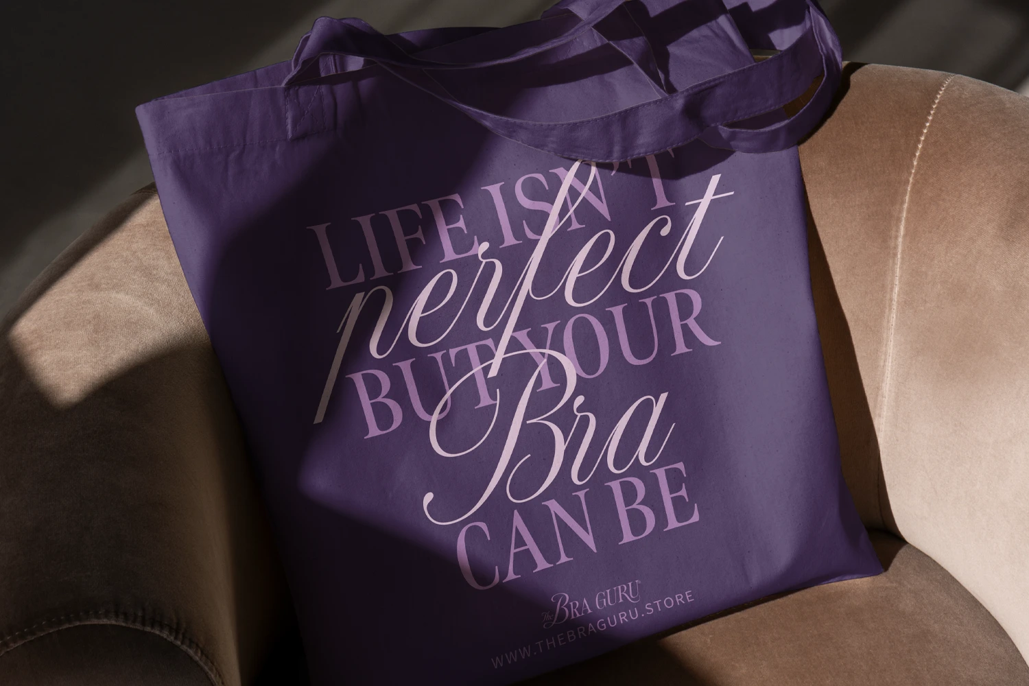
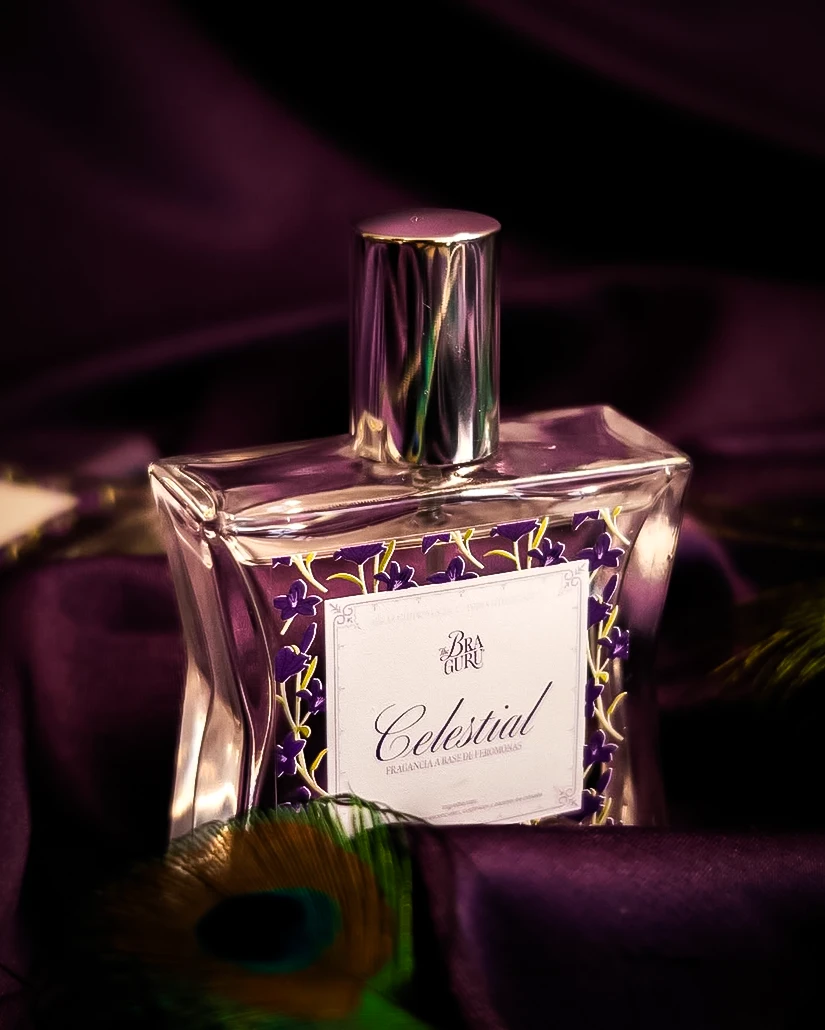
Solution: Boobgie. Since they refer to their clients as goddesses and queens, getting inspiration from the Rococo and Art Nouveau movements was a no-brainer. Colors were easy. They were already using purples and pinks so we stuck with a purple palette but made it regal. We went Rococo with frame elements and Art Nouveau with the florals. After showing her the new proposal, the logo was screaming for a refresh. We kept the idea of using a script font and opted for a serif and script combination. We went all in with this brand. From the branding to the packaging to the photographic style. Just in time for their 8th anniversary.
Featured On:
Client Feedback
Working with Mondos has been a pleasure from the beginning. Since I met them I could see their ingenuity, their creativity, and their good taste. Allison's vision, her ease of understanding my brand concept, and the experience and guidance she provided made the transition to our new image extremely easy and exciting. They opened my mind to new possibilities and ideas like no one else had, they refined my brand from the inside out, and they brought great perspectives and opportunities to my business. I consider their support and follow-up to be truly invaluable. Today I consider Mondos as an important part of The Bra Guru's history and I am very grateful to have found them. I recommend them 1000%!
—Ana Maradiaga
Project Playlist
Scan with the Spotify app or click for web player.
