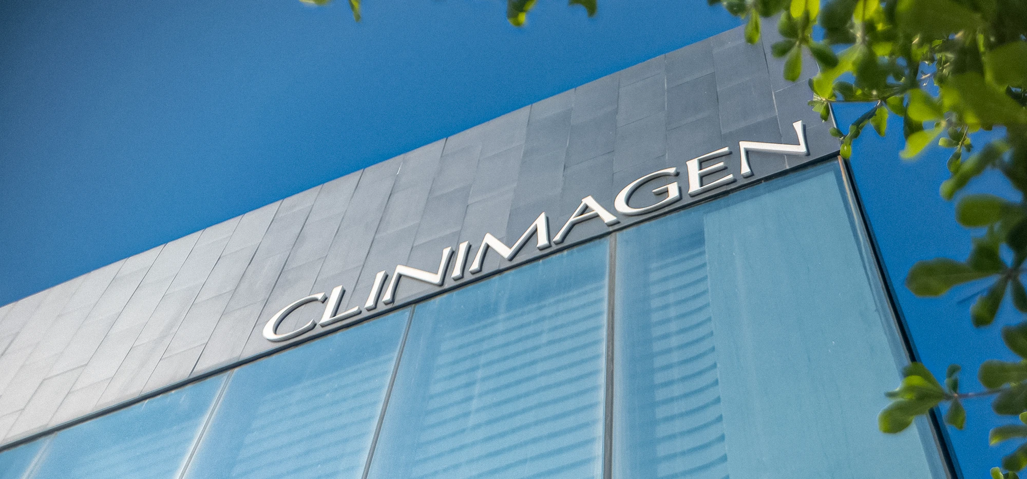
Balanced Beauty
A spa-clinic that combines relaxation, technology, and personalized care to achieve natural results that reflect genuine wellness and beauty.
Client—Clinimagen
Services—Branding & Web Design
Industry—Spa & Well-being
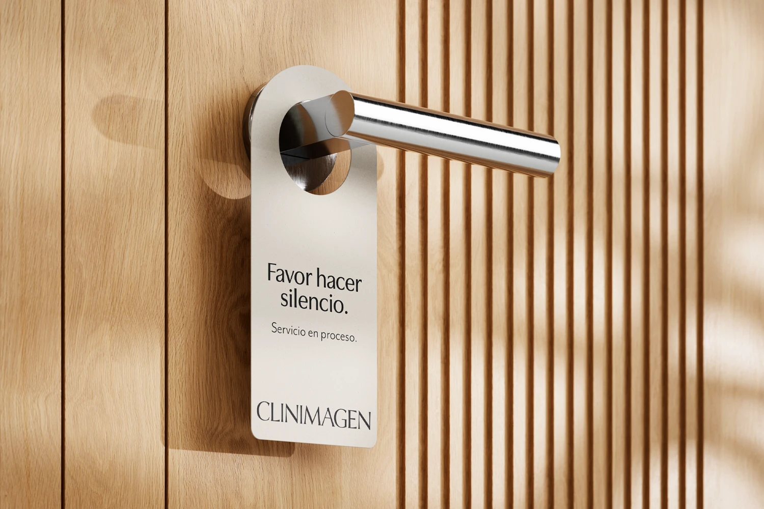
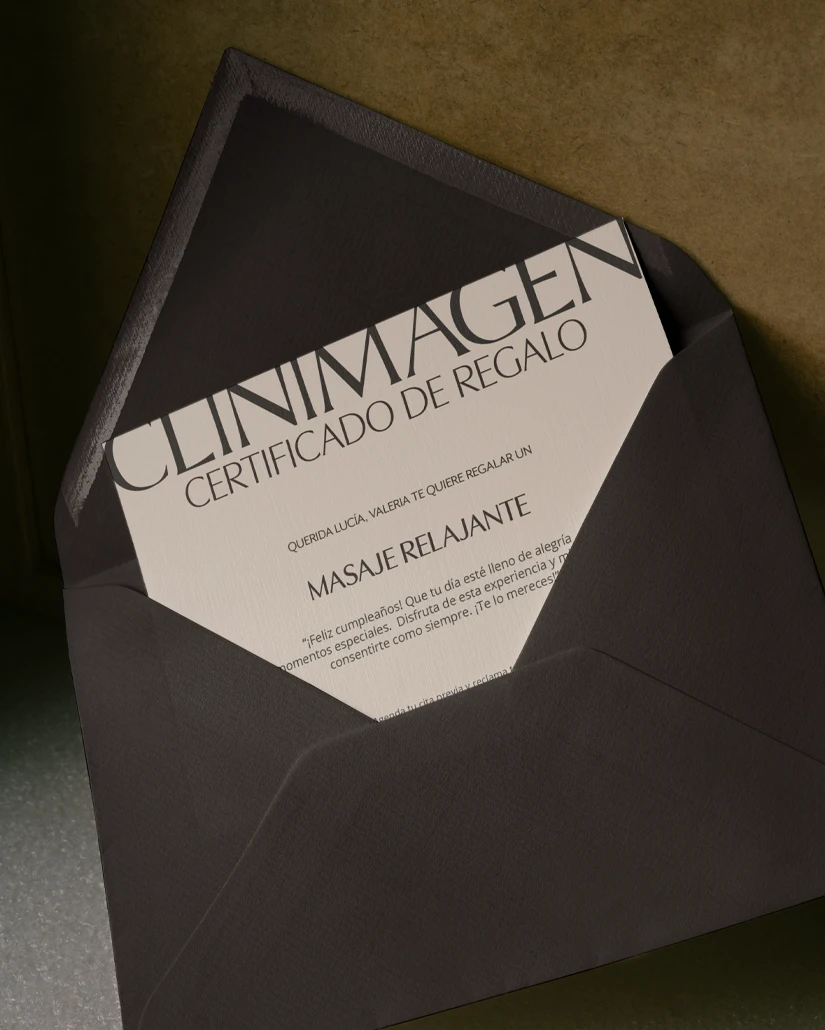
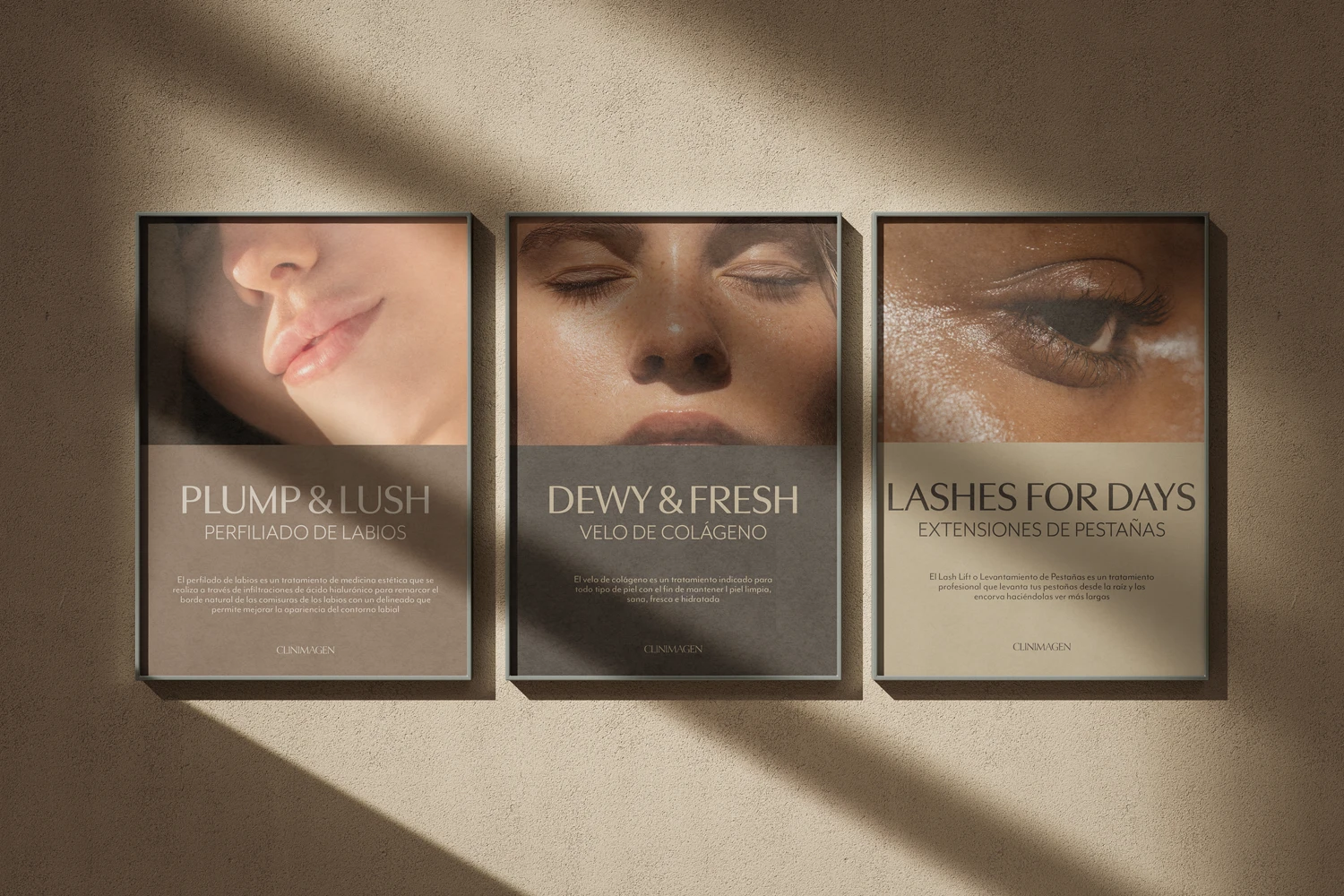
Given the brand’s focus on skin health and personalized treatments, the color palette was inspired by the natural variety of skin tones, reflecting warmth, and a sense of comfort.
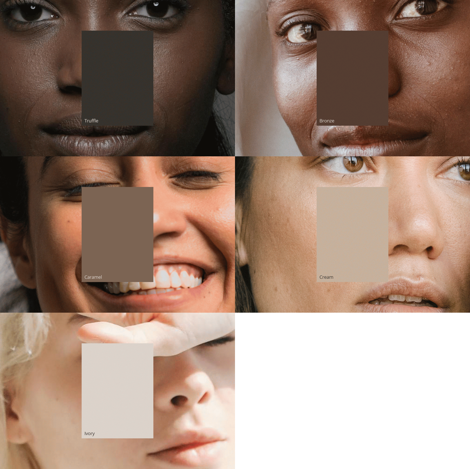
Given the brand’s focus on skin health and personalized treatments, the color palette was inspired by the natural variety of skin tones, reflecting warmth, and a sense of comfort.
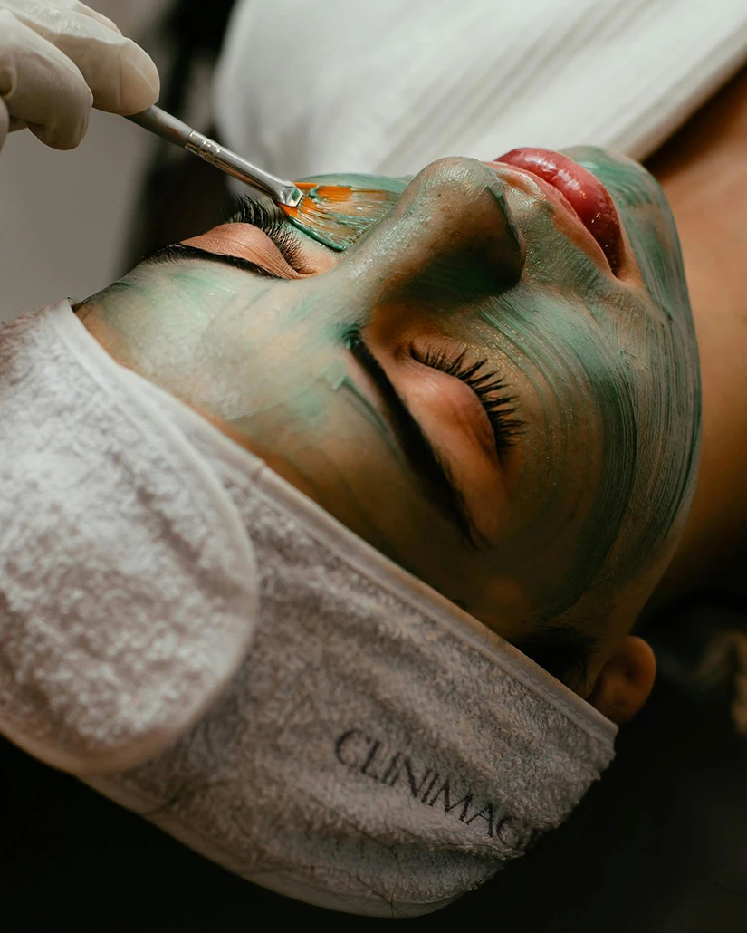
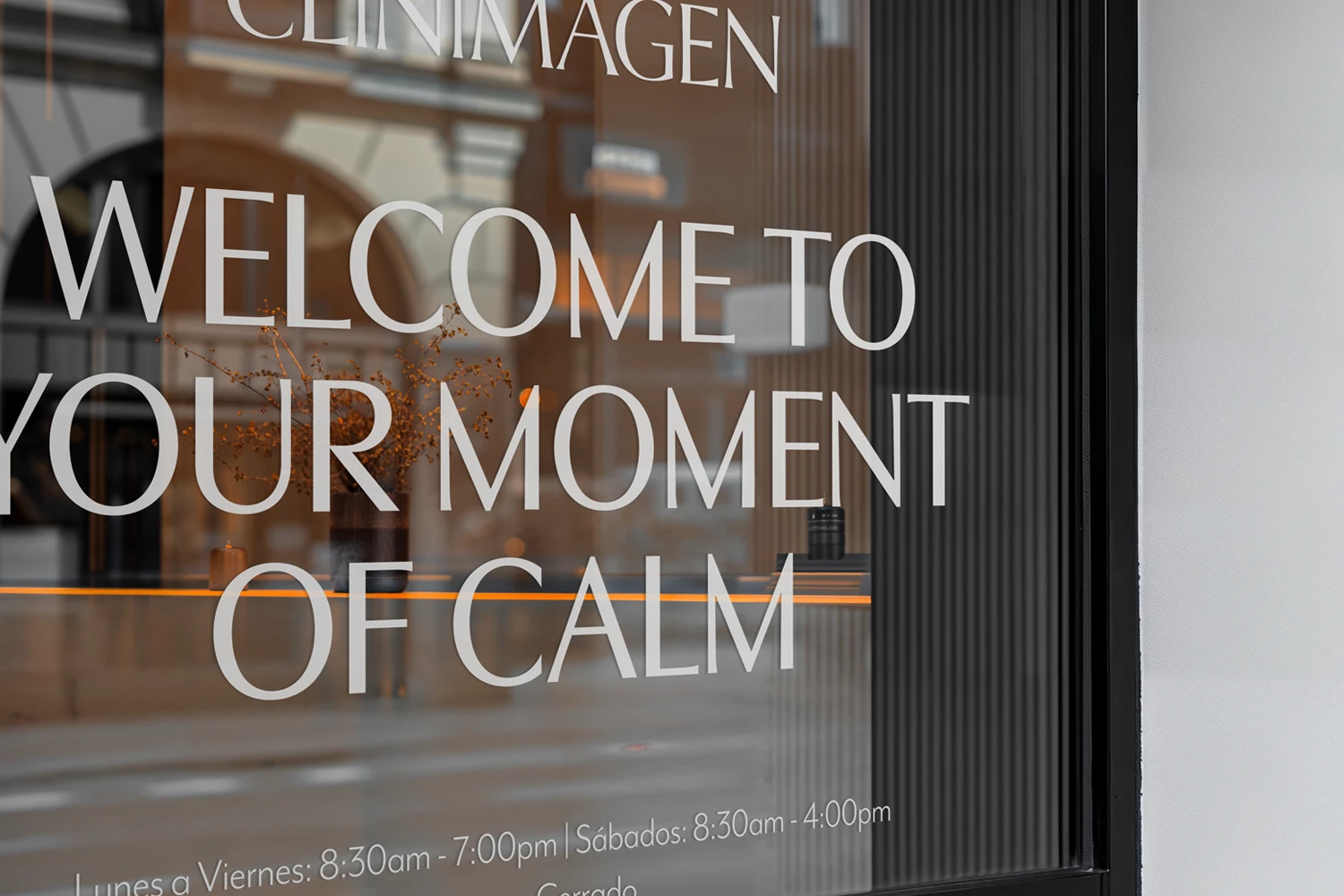
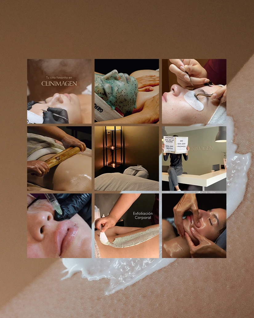

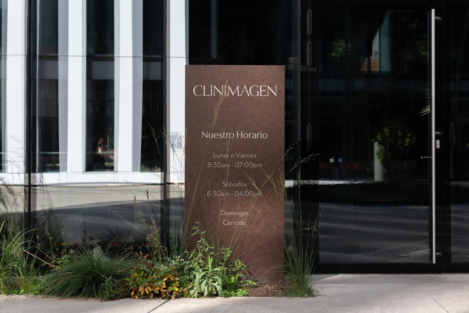
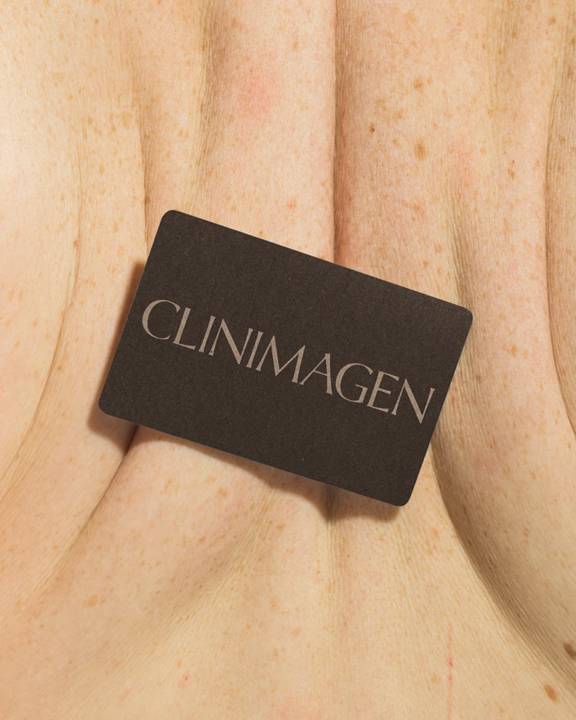
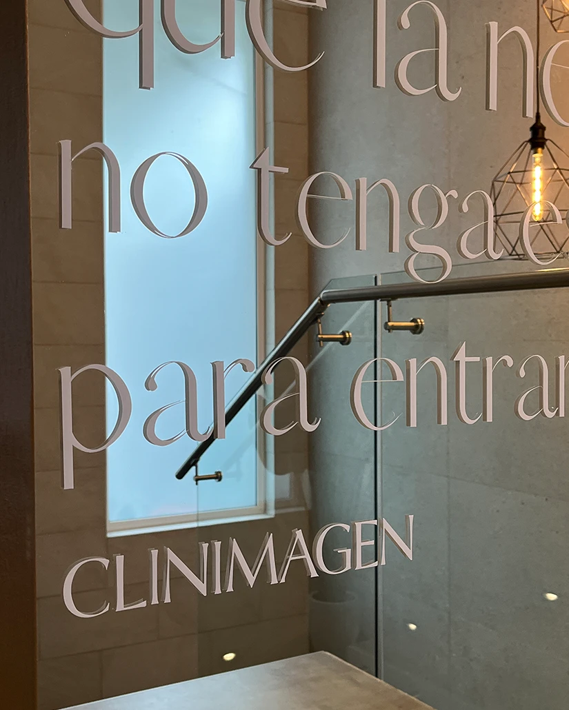
We aimed to find a typeface that balanced the softness of their spa services with the professionalism of their clinical treatments. In the end, we drew inspiration from the Optima typeface and customized it to achieve the perfect harmony between both worlds.
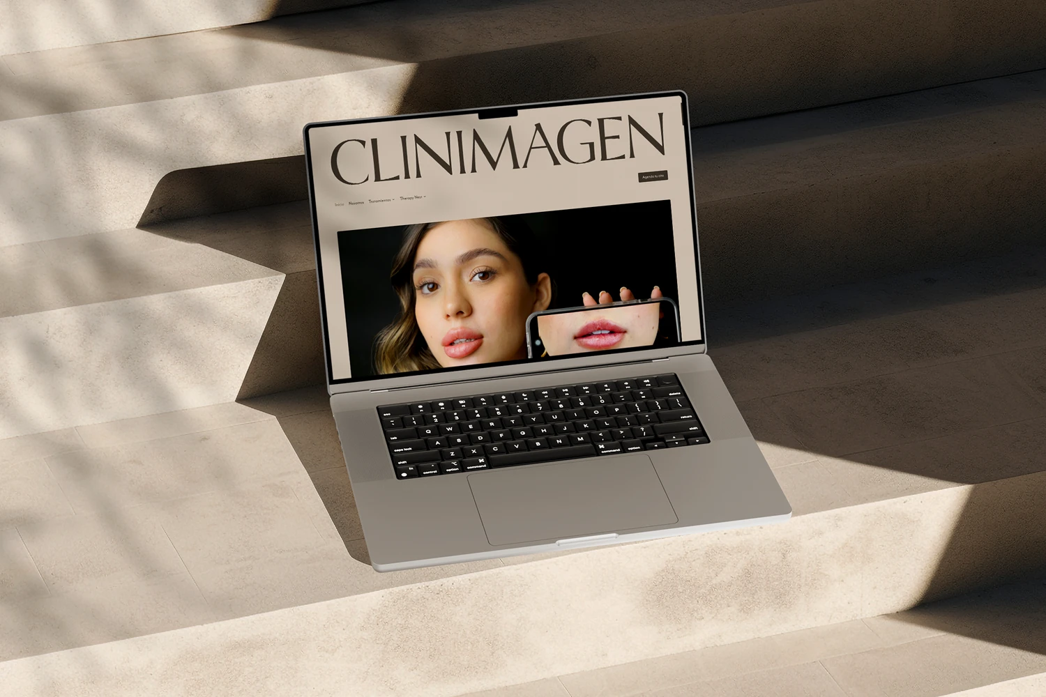
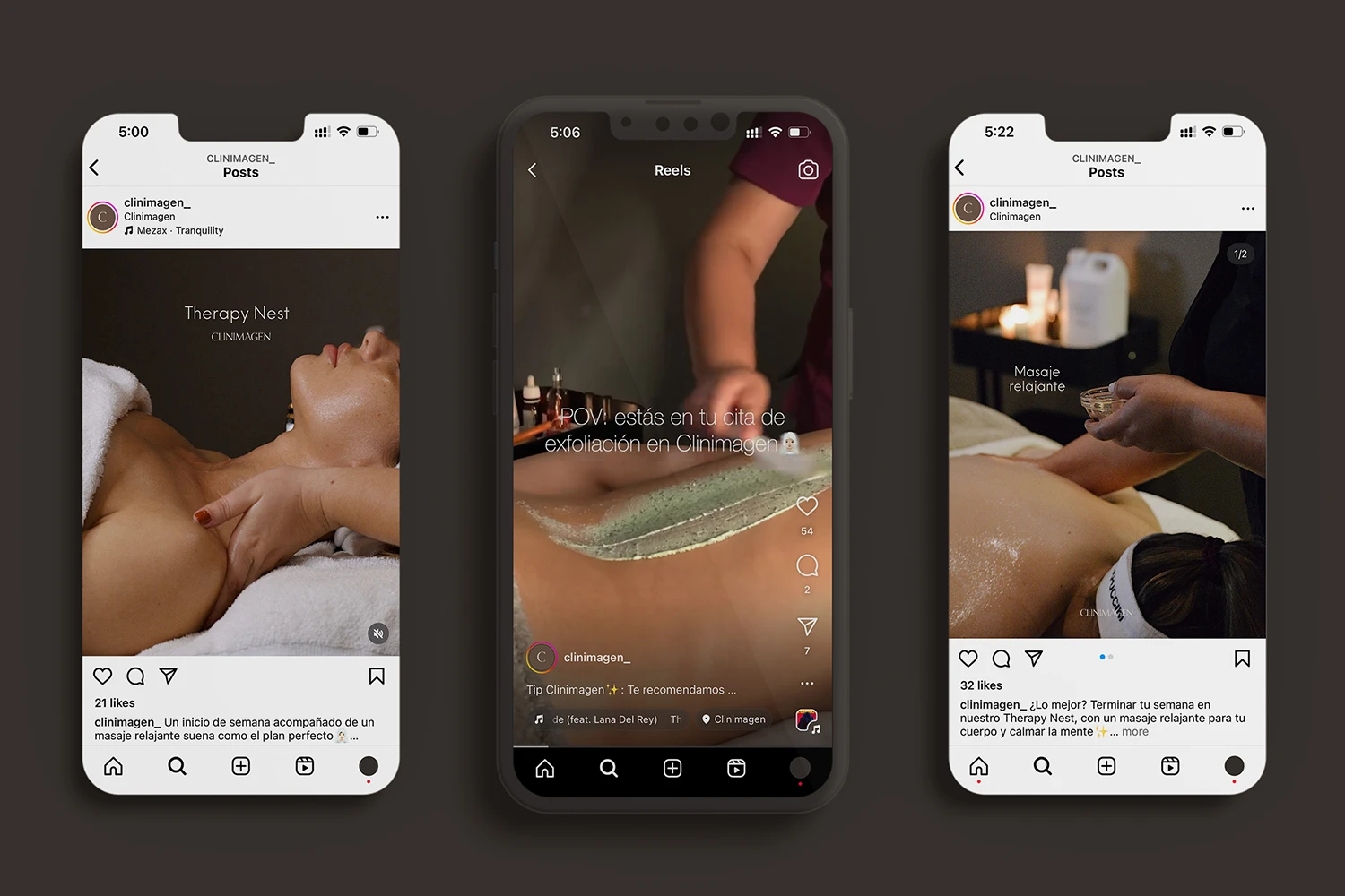
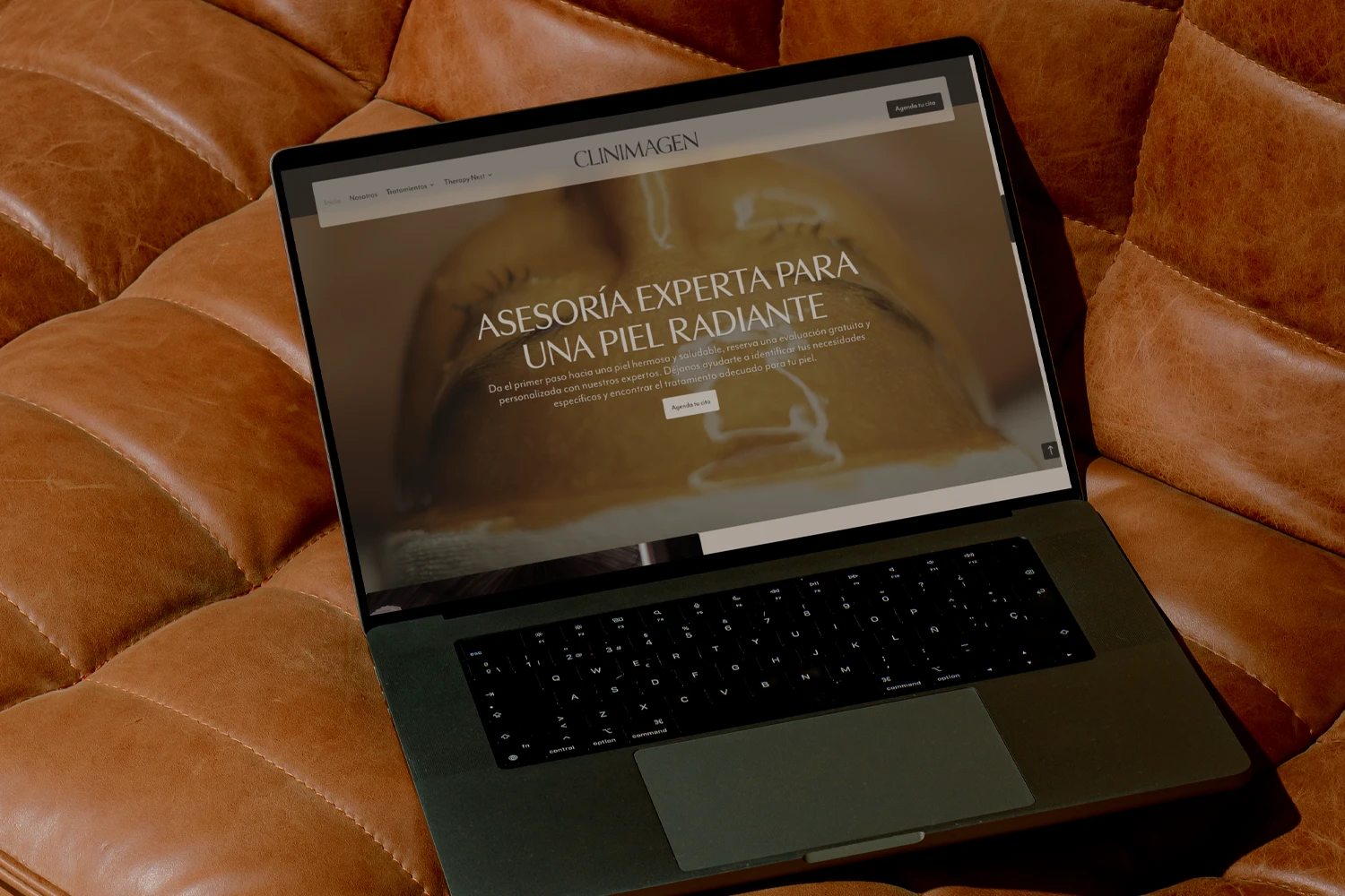
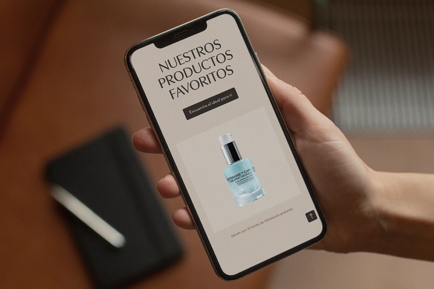
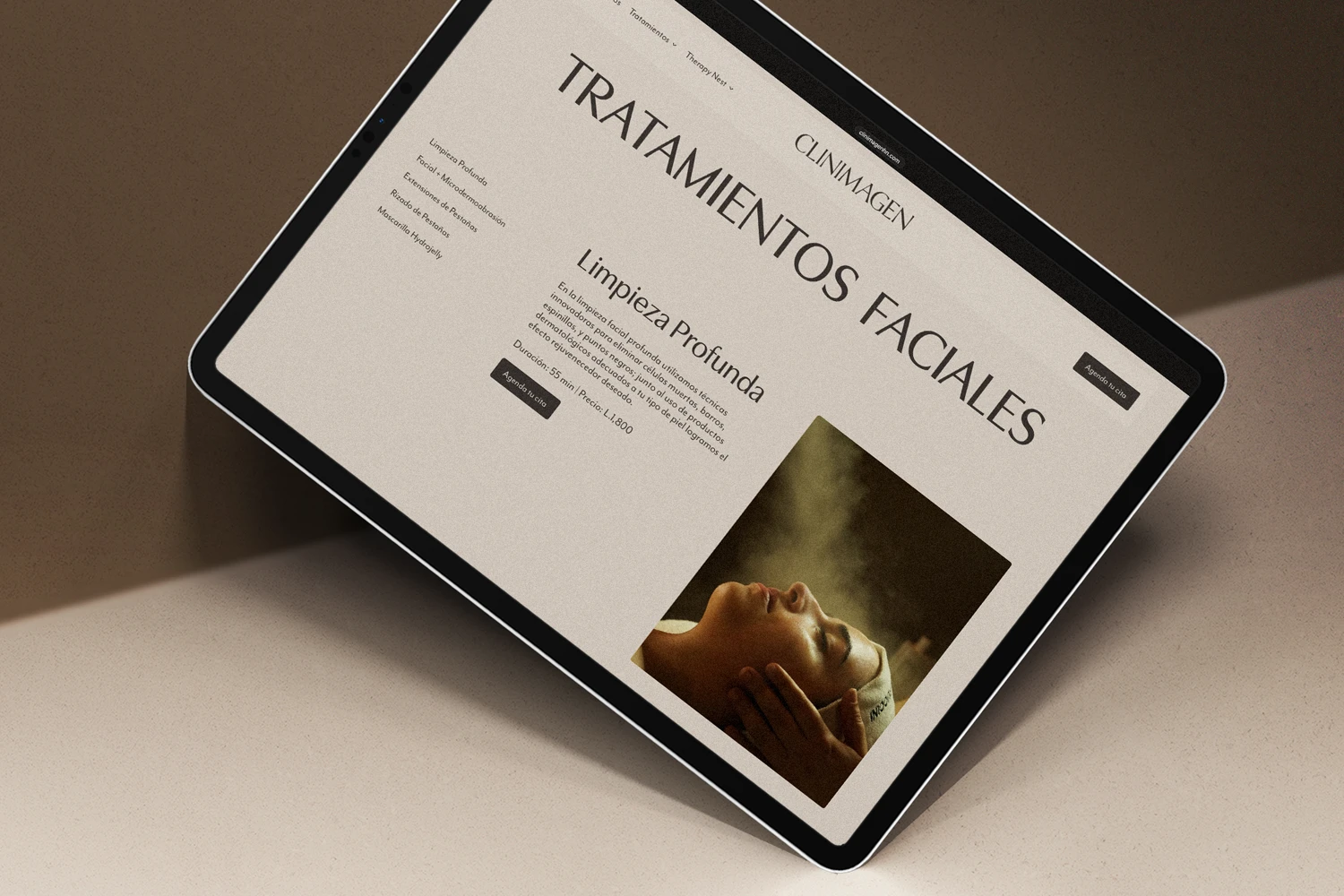
Designing the website was another opportunity to extend the brand’s cozy and welcoming essence. Through the thoughtful use of color, typography, and tone, we sought to evoke the same sense of calm and care that clients experience during their treatments.
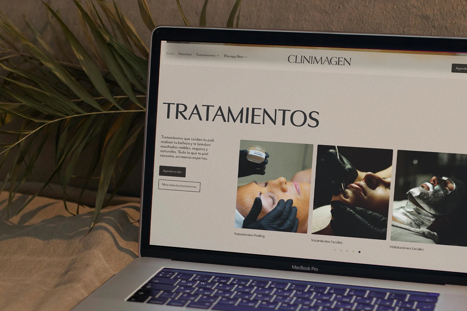
Designing the website was another opportunity to extend the brand’s cozy and welcoming essence. Through the thoughtful use of color, typography, and tone, we sought to evoke the same sense of calm and care that clients experience during their treatments.
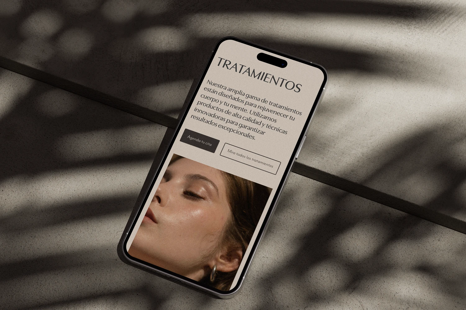
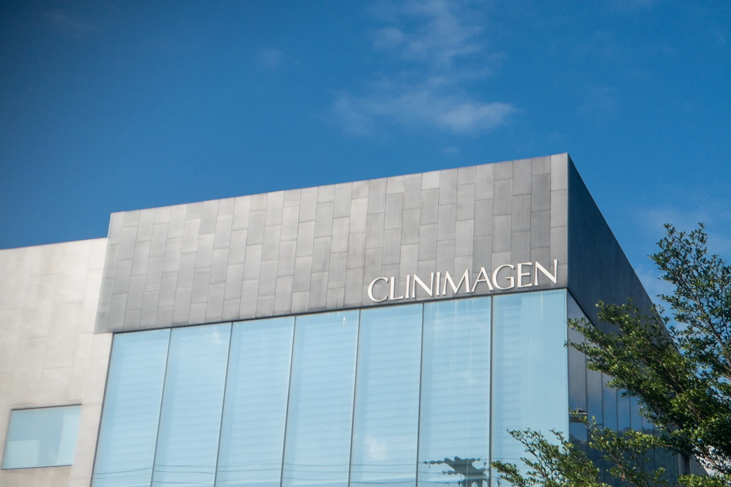
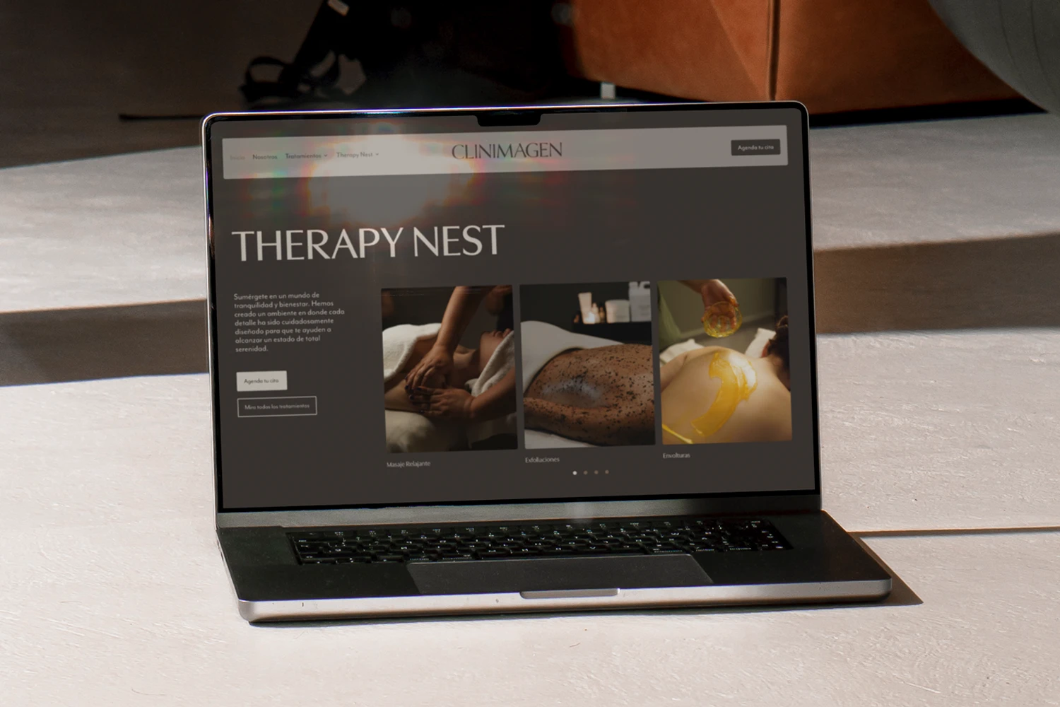
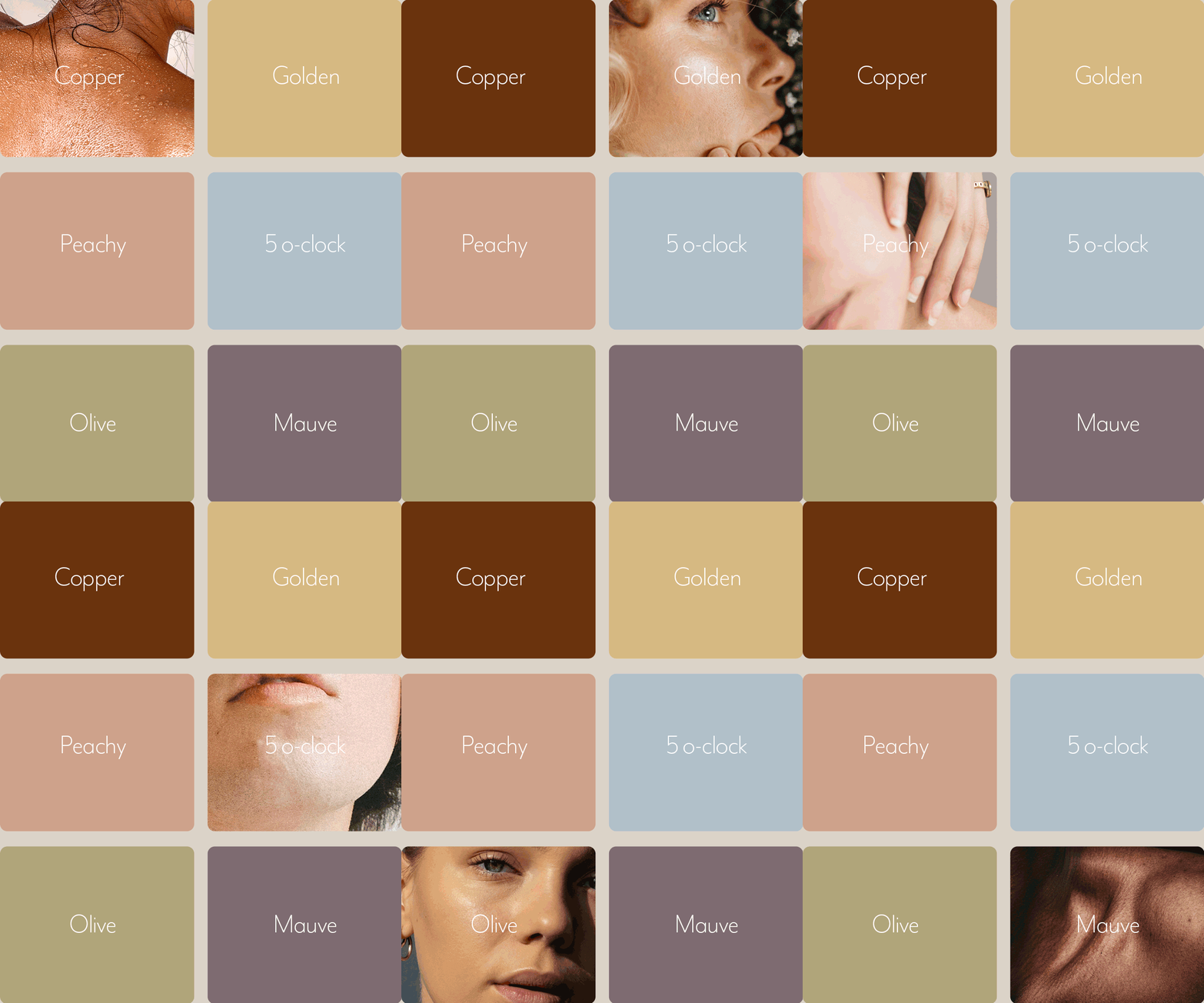
Since the primary colors are inspired by natural skin tones, the secondary colors are derived from subtle details and tones already present within the skin itself. This approach helps create a palette that feels balanced and cohesive, making the overall design more harmonious and visually connected.


Project Information
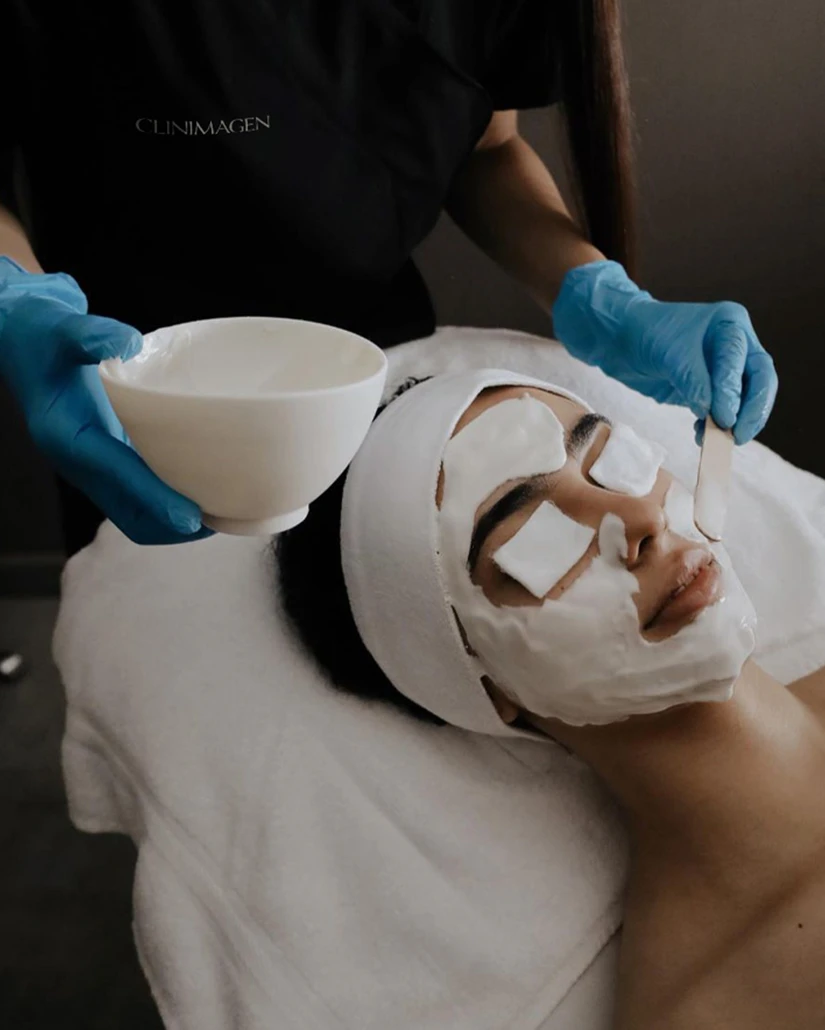
Clinimagen has been a pioneering esthetic clinic and spa for more than 30 years. Their focus is to create a balanced beauty for their patients with their treatments and to improve their physical and mental well-being. Everything they do is done with their patient's best interests in mind. They take pride in their craft, their staff, and their amazing results.
Challenge: They came to us in need of a website since the one they had was outdated. While in our meeting, we all realized it was a good time for a well-deserved brand refresh. They were looking for their branding and website to reflect the quality of their work and space.
Solution: Since they offer medical esthetic treatments and spa and beauty services, we wanted to create a balance between both. We got inspired by Hermann Zapf's Optima where there's a perfect cross between the seriousness of serifs and the modernness of san-serifs. Thus creating a semi-serif font for the logo. As for the brand colors, we were inspired by the variety of skin tones focusing on brown shades for a cozy and familiar feeling with a touch of a warm and colorful palette inspired by those hints of color in our skin.
Project Playlist
Scan with the Spotify app or click for web player.
