Risks and Rewards of Rebranding
Date
Category
Share
Many, if not most, graphic designers dislike being considered artists. I think they should reconsider what it means to be called an artist.
Let’s begin with what a brand is. Marty Neuemeier says that a brand is a person’s gut feeling about a product, service, or company. Simple enough, it is what a group of people think or perceive a company. So what is rebranding then? If a brand lives in the audience’s mind, then rebranding is an attempt to change that perception. It is something you can’t control but that you can influence. If done right, it solves a problem. If done wrong, it becomes a problem.
What are the risks of rebranding?
Is rebranding a risk? Yes. There is a reason big companies pay a lot of money to expert agencies. These agencies are great at brand management. The least risky option is usually the best option. It is an investment in the future of a company.
Just consider what comes along with changing a logo. Chances are it will need to be changed in more places than just the Instagram profile picture. Everything has to be remade to reflect the new brand. That costs a lot of money and time.
Another issue to consider is about being recognizable. A drastic change of appearance might make the brand unrecognizable to its customers. Resulting in a decrease in sales if they can’t find the new product on the shelves. And what if it is a beloved brand with incredibly loyal fans such as sports teams? Even a small change will anger fans that have grown to love the existing brand.
Loss in sales? Angry loyal fans? That doesn’t sound good. So, yes, rebranding is a risk. However, the far bigger risk is a rebranding carried out incorrectly. If that happens, it will lead to all the consequences we talked about before. It can destroy a brand’s equity, consequently making a company much less valuable than it was. Let’s look at some examples.

Tropicana
Tropicana decided to change its packaging in 2008, and it did not go well, to say the least. The new packaging made the brand unrecognizable by removing the most beloved and recognizable element: the orange with a straw. After a month of complaints and a 20 percent drop in sales, corresponding to approx. $30 million in losses, Tropicana changed back to the old carton.

GAP
GAP tried to refresh its logo back in 2010. The rebrand was received with so much backlash that it changed back to the original in just a week. You read that right. One. Week. The backlash included a mock Twitter account and a website called “Crap Logo Yourself” that let users make their own Gap-inspired logos. The logo lost its personality into something dull and generic, resulting in all the chaos that followed.
Coke
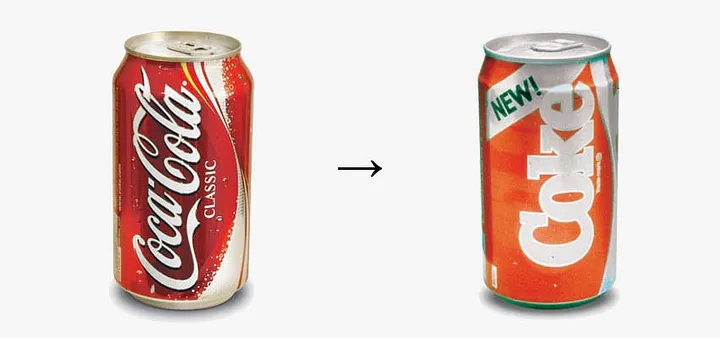
Pepsi had a moment of brilliance when it released the Pepsi Challenge. The challenge was a blind taste between Coke and Pepsi. Pepsi was picked over Coke by a significant margin. Then Pepsi advertised the results, showing people picking Pepsi. This sent Coke into a frenzy resulting in the launch of the New Coke. The result? It didn’t go as planned as 400,000 people wrote letters demanding that they change it back. Coca-Cola returned to its classic formula a few months later.
MasterCard
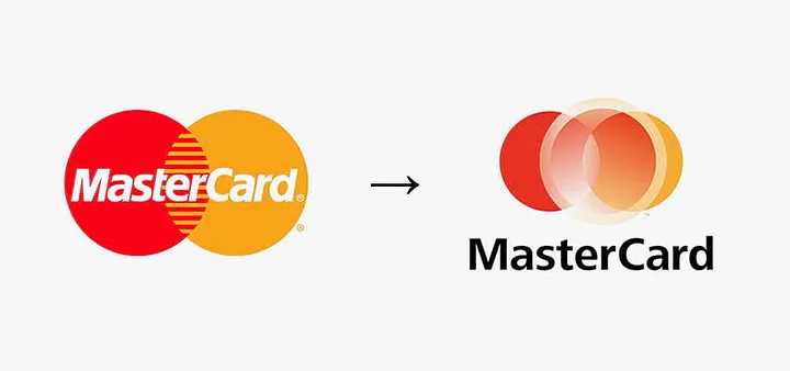
Mastercard is one of the most ubiquitous brands in the world. They are recognized globally in an instant. This is why it’s rebranding in 2006 caused confusion with its audience. The problem was the idea behind the execution. If the most distinguishing aspect of their logo is the two circles, adding a slightly off-centered brownish circle with a gradient on top will not help. This actually made the two original circles lose protagonism. Mastercard eventually returned to its old logo. A decade later they did it right.
What are the rewards
of rebranding?
I am not trying to scare you. It is just a precaution. Rebranding should be handled by experts in the field because it is critical to get it right. It is an investment in the future of the company. If done right, rebranding a company can put a brand in a better position to succeed.
Many businesses and organizations with decades of history are missing out on the rewards of a unified, recognizable brand identity. I understand the sentiment behind “if it ain’t broke don’t fix it,” but with room for improvement, it would be unwise to not take it. With so many years in business and not having a clear guideline to what colors, fonts, logo variations to use, a company’s brand identity starts to get muddy. Renewing the brand can bring consistency to it. And the guidelines that come out of it will save time and money in all future marketing efforts.
“Rebranding is an investment in the future of the company.”
When a brand is consistent, it becomes recognizable. And if it is honest about their voice, personality, and what sets them apart, it will stand out from their competition. The ultimate gain is that it inspires customer loyalty. When a person trusts full-heartedly a company, it is the ultimate shortcut to a buying decision. Also, consider the 80/20 rule, where 20 percent of a company’s customers account for 80 percent of its profits. Finding what makes a brand unique and staying true to that promise and its most loyal customers is the right way to rebrand a company.
Last but not least, rebranding helps a business change the negative perceptions people might have about a company. Turning them into a positive. If companies try to take an easy way out by just changing a slogan and nothing else, customers will see right through it because they are too smart. A change in work culture, mission and vision, or a different business model might be necessary to correct course. A change in brand identity and messaging can signal a change, but it must be real in order to reap the rewards of rebranding. Let’s look at some examples of rebranding done right.
MasterCard
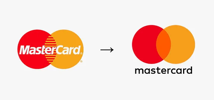
A decade after their failed rebranding, Mastercard hired Michael Bierut from Pentagram to do their rebranding. What made the Mastercard brand recognizable? Easy, the interlocking red and yellow circles. By simplifying the circles and dropping the name below, Mastercard became easier to recognize. An approach opposite to what that done a decade before. Mastercard also has guidelines on how to use the iconic interlocking circles online, making it stay consistent around the world saving countless time and effort.

Van Leeuwen’s
Brooklyn-based ice cream brand Van Leeuwen hit the nail on the head with their rebrand. It was beginning to be overlooked by customers with too many ice cream options, and most packaging tried to communicate too much information, including Van Leeuwen’s. To solve this problem, the owners turned to Pentagram partner Natasha Jen. By keeping the familiar script for the wordmark, using cheery pastel colors, and stripping all the extra clutter, Natasha and her team made the brand stand out from the competition. The packaging looks delicious, just like ice cream, with rich and delightful colors helping sales rise by 50%.
Apple
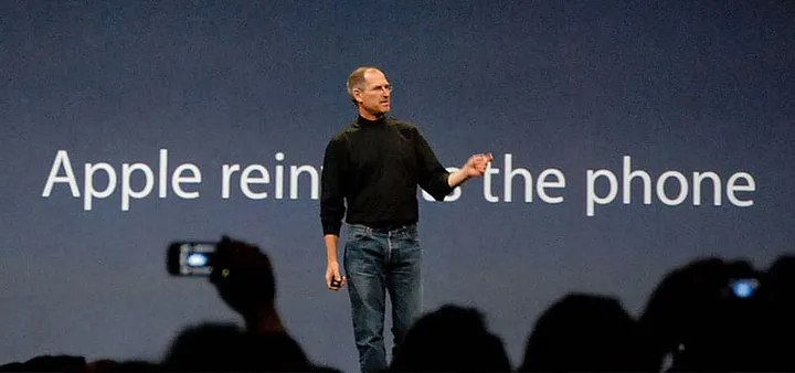
In 1997, Apple was close to bankruptcy. Enter Steve Jobs. An artist at heart, Steve Jobs saw it as a priority to release well-made creative products enhanced by beautiful packaging. At the time, Apple had too many products compounded by poor marketing and branding. The new products released under Steve Jobs were reliable and elegantly designed. Not only that, but how they were packaged, advertised, and marketed was a thing of beauty. All directed by Apple’s belief in the simple, not the complex.

Old Spice
In 2010 there was a stigma that Old Spice made you smell like your grandfather. Not exactly appealing to a younger generation. With the clever ad featuring Isaiah Mustafa telling women to “Look at your man, now back at me,” Old Spice started to change its tone and positioning. The ad and videos that followed with the same witty bravado changed the way Old Spice was perceived by the general public. They didn’t change the logo but changed the experience.
Choose wisely
Rebranding can be a risk. Plenty of times risk is worth taking. With the correct guidance, rebranding can only improve a brand by setting the right direction for the future. Whether it be a name change, a change in identity, or a change in communication, it must first be analyzed, and then carried out.
