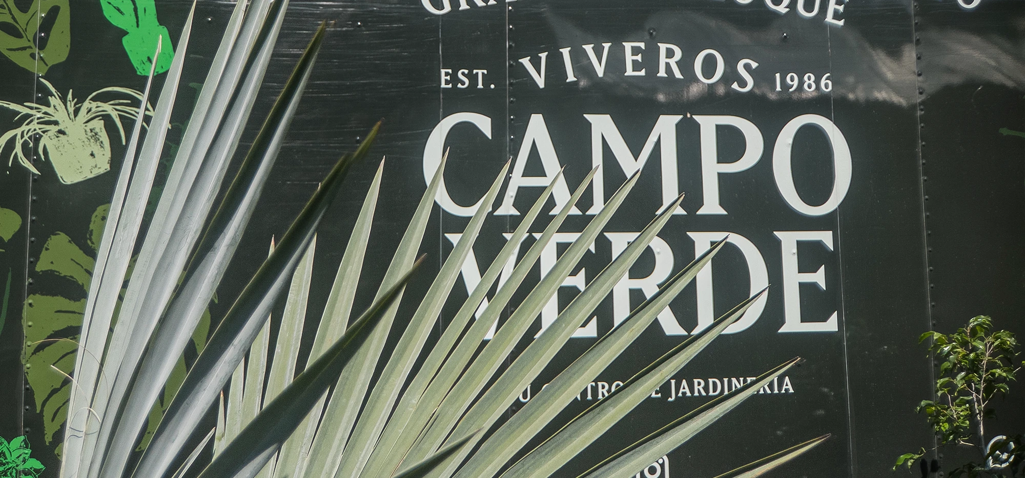
Bringing Nature to Spaces
Viveros Campo Verde is a family-owned plant nursery founded in 1986, specializing in landscaping, houseplants, and all things gardening.
Client—Viveros Campo Verde
Services—Branding
Industry—Gardening & Landscaping
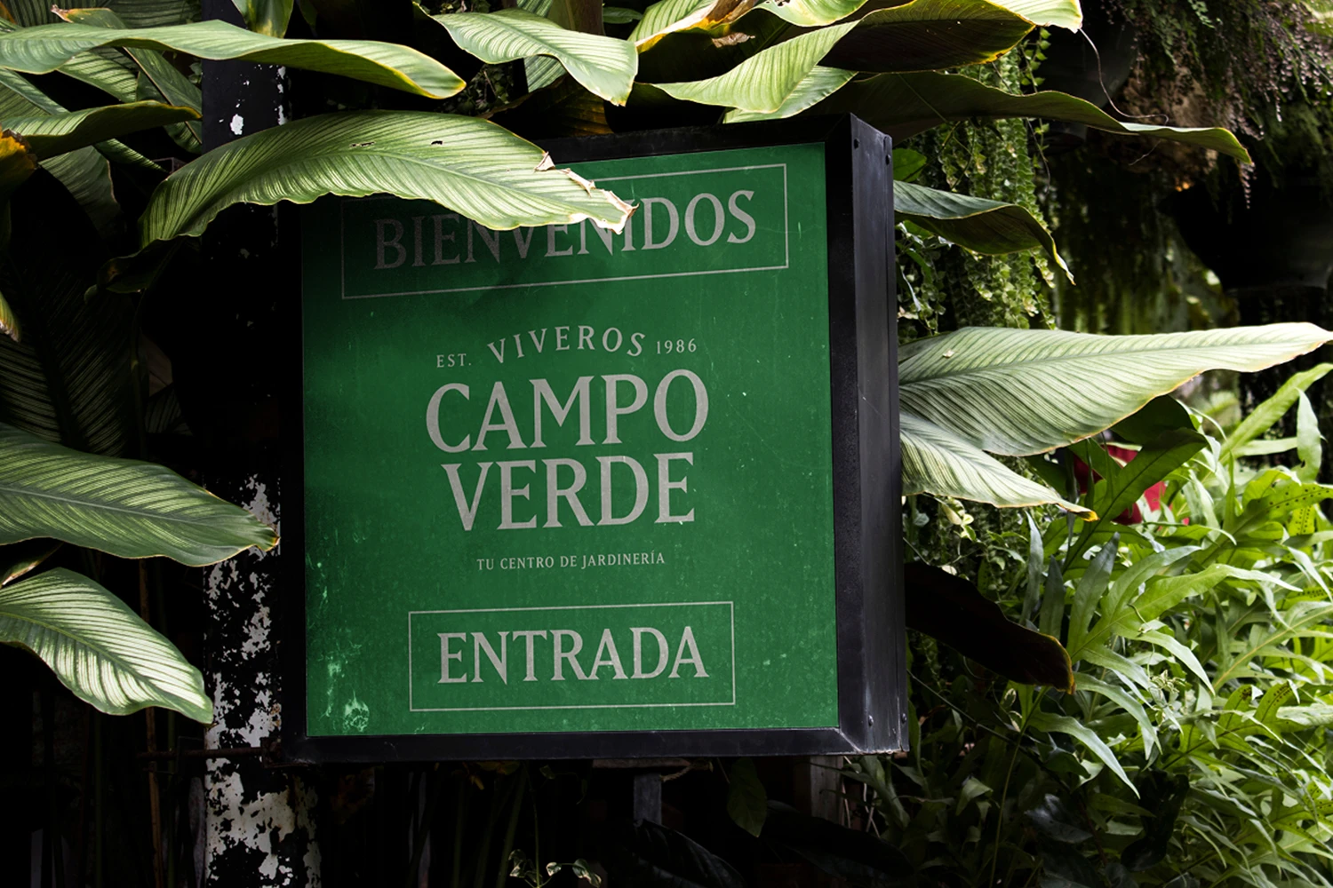
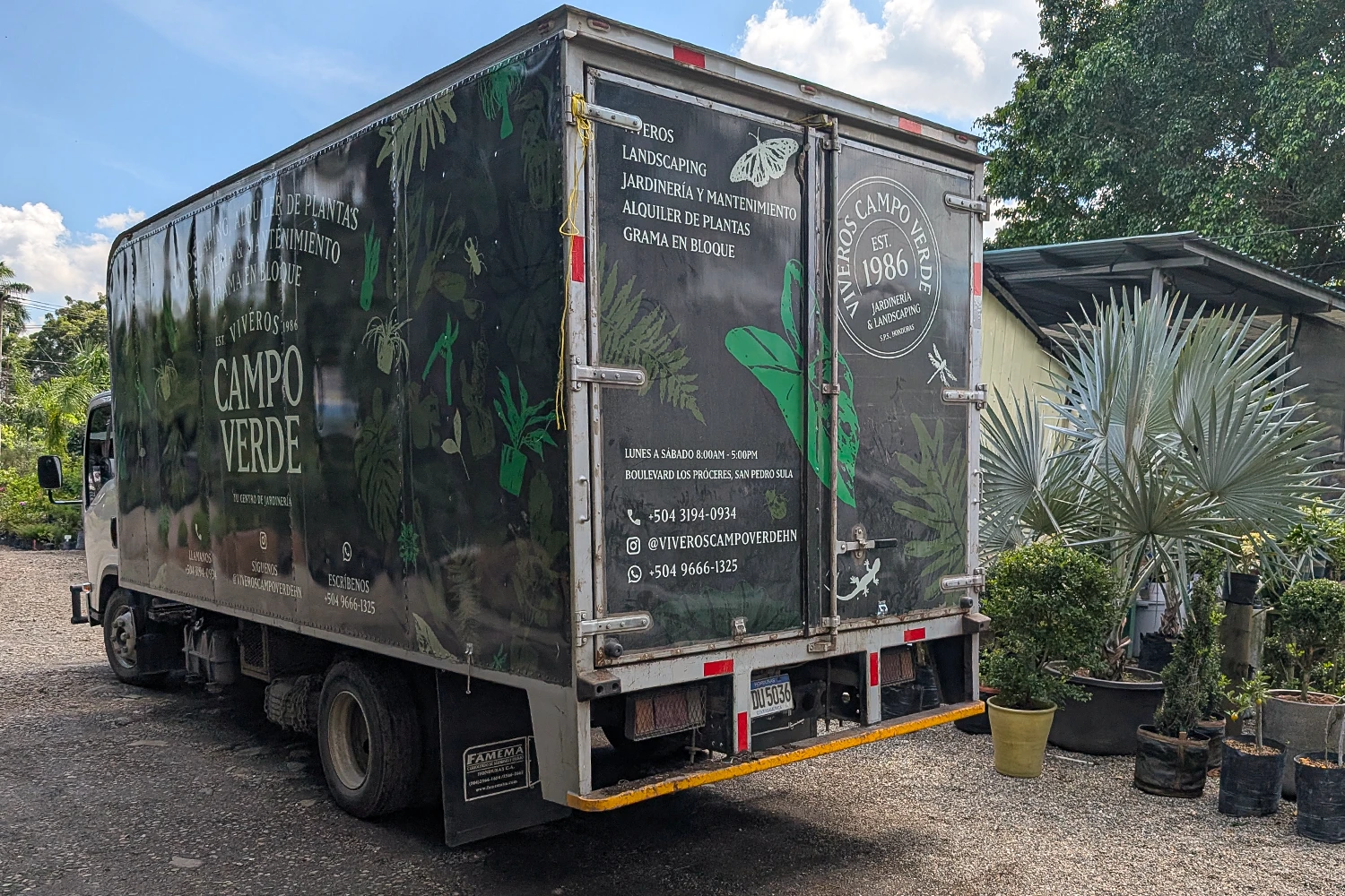
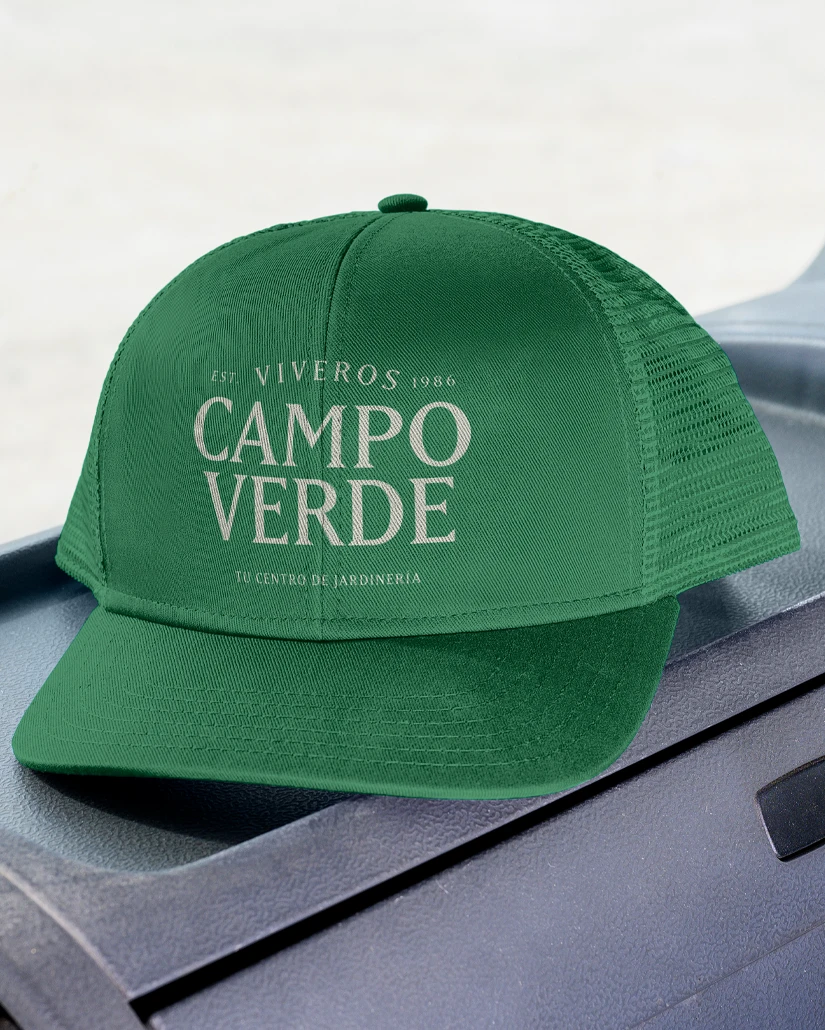
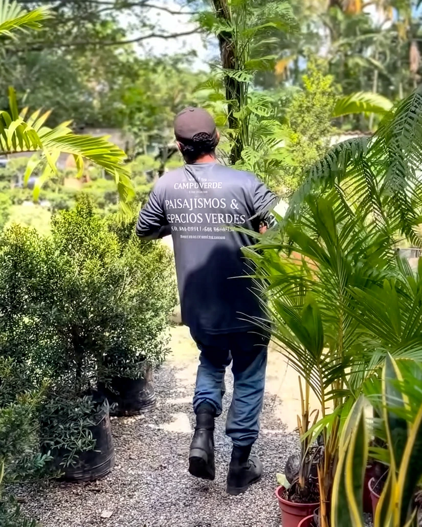
The logo system is designed with multiple slogans, allowing it to change based on the service being offered.
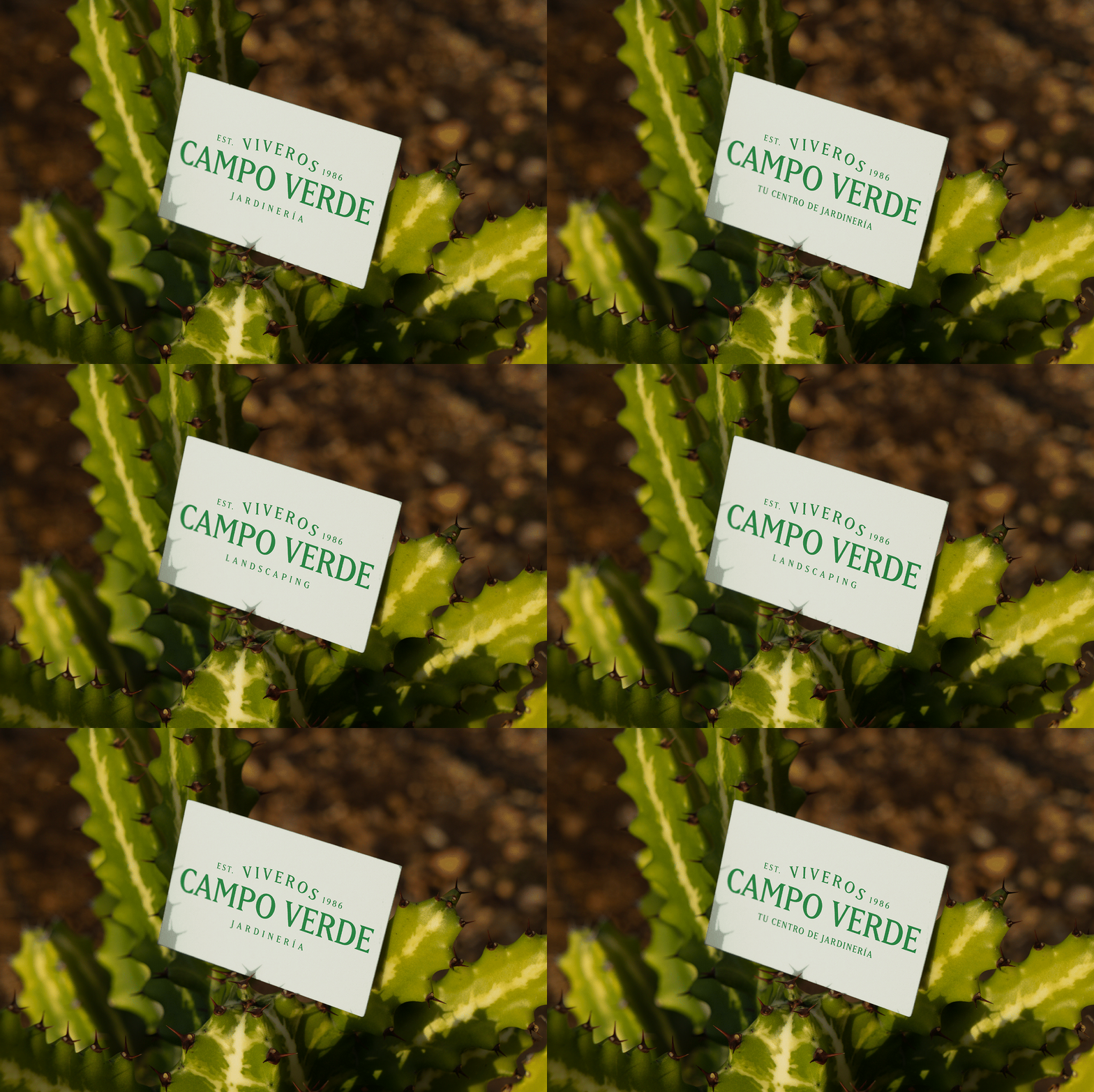
The logo system is designed with multiple slogans, allowing it to change based on the service being offered.
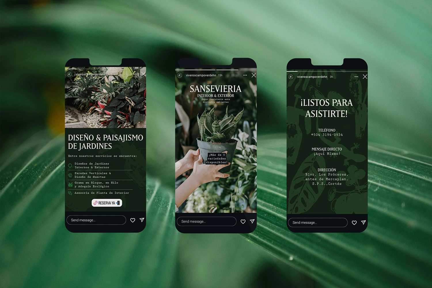
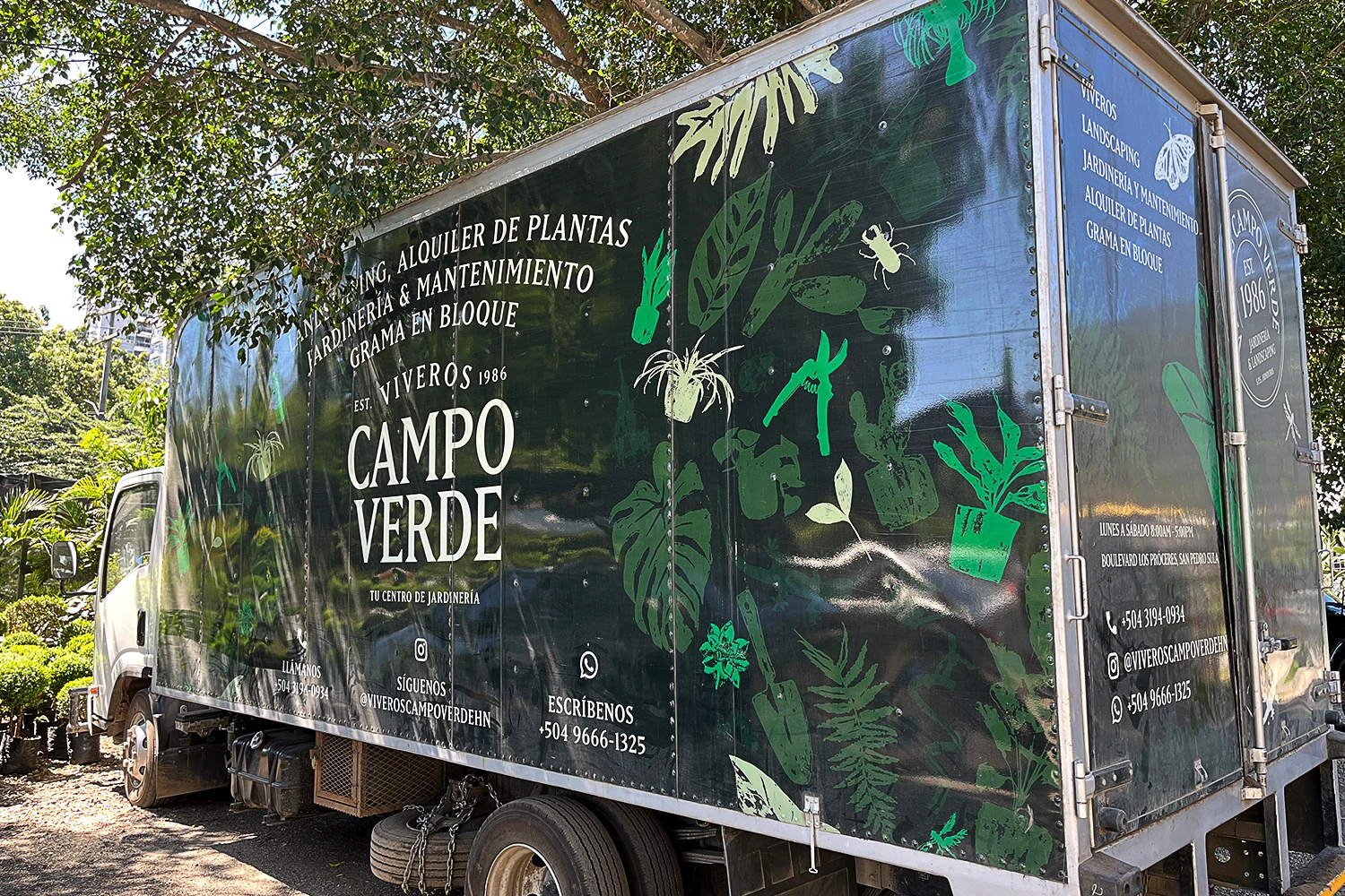
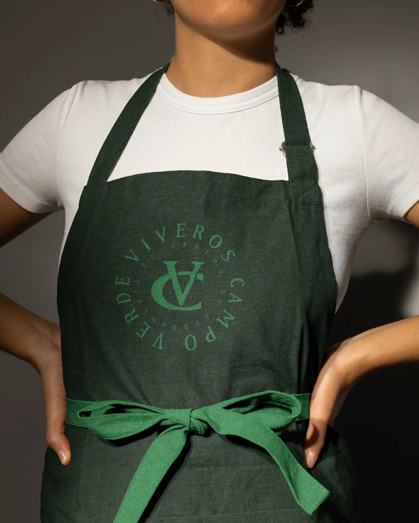
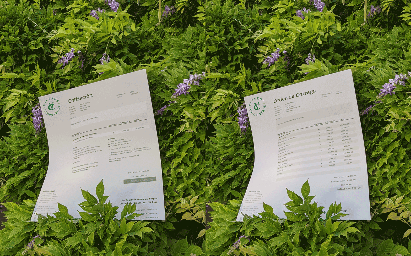
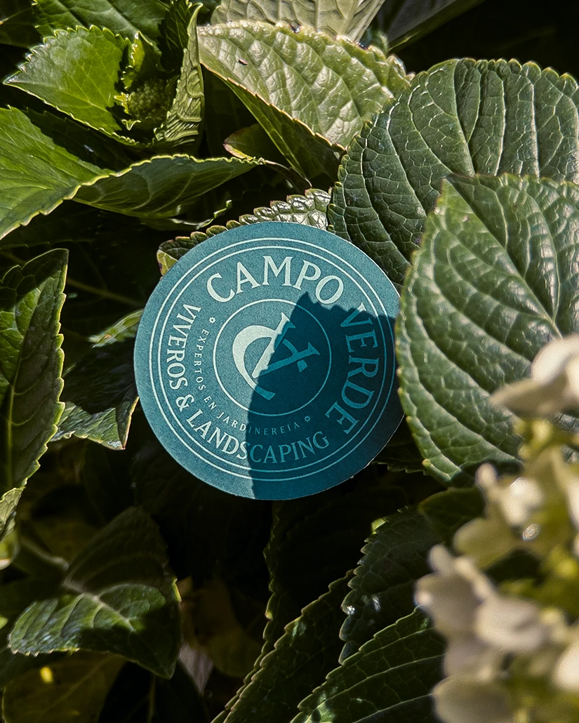
The brand also features monograms used as decorative elements in more informal applications, functioning like a stamp of approval. This detail highlights the brand’s heritage and reflects the many years they have been in business.
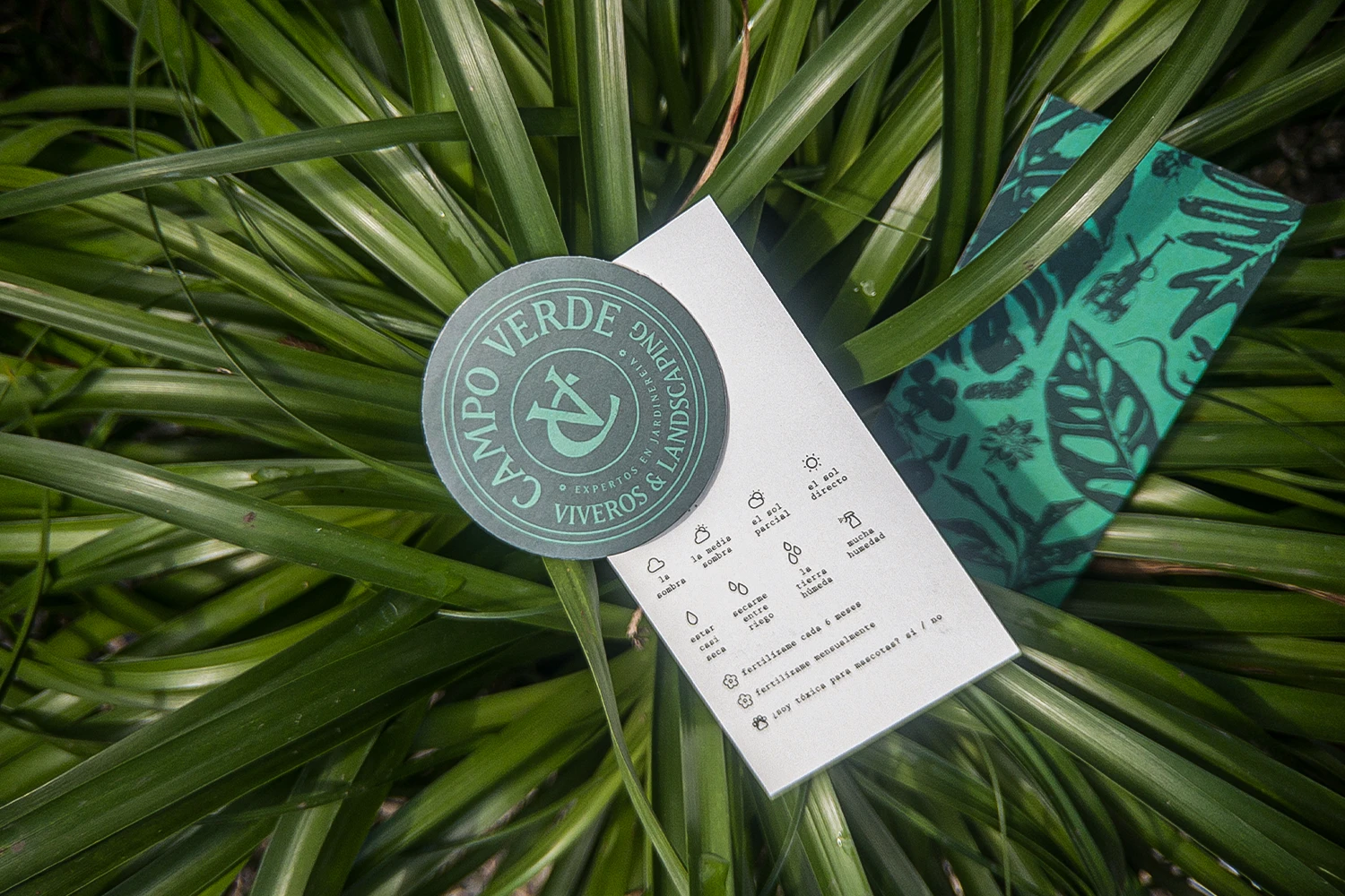
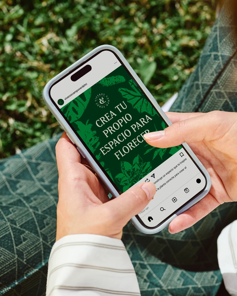
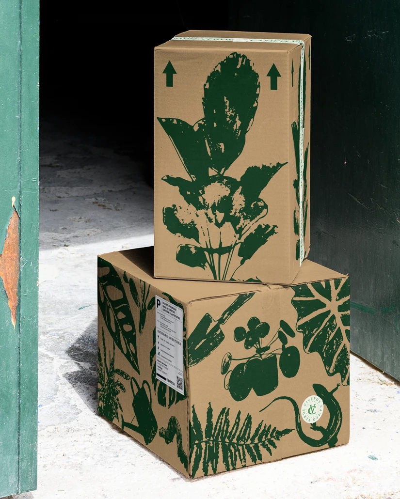
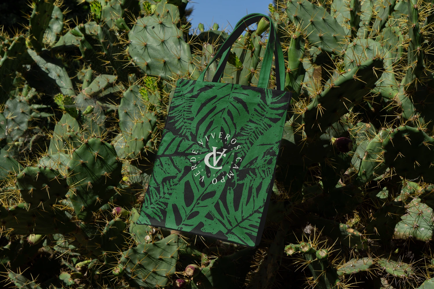
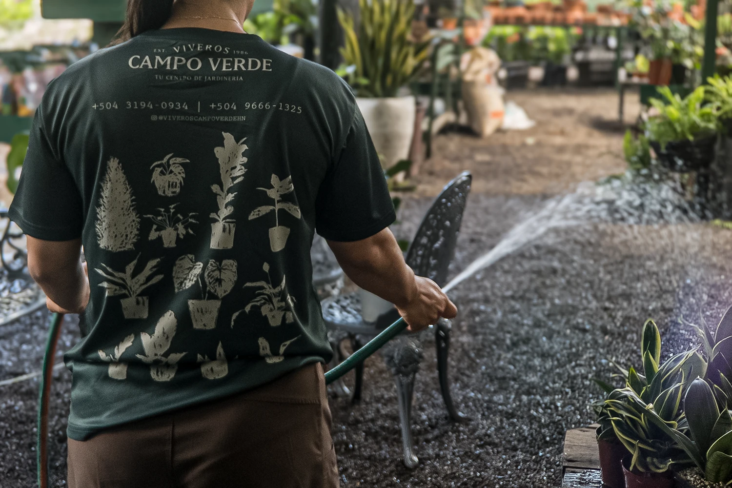
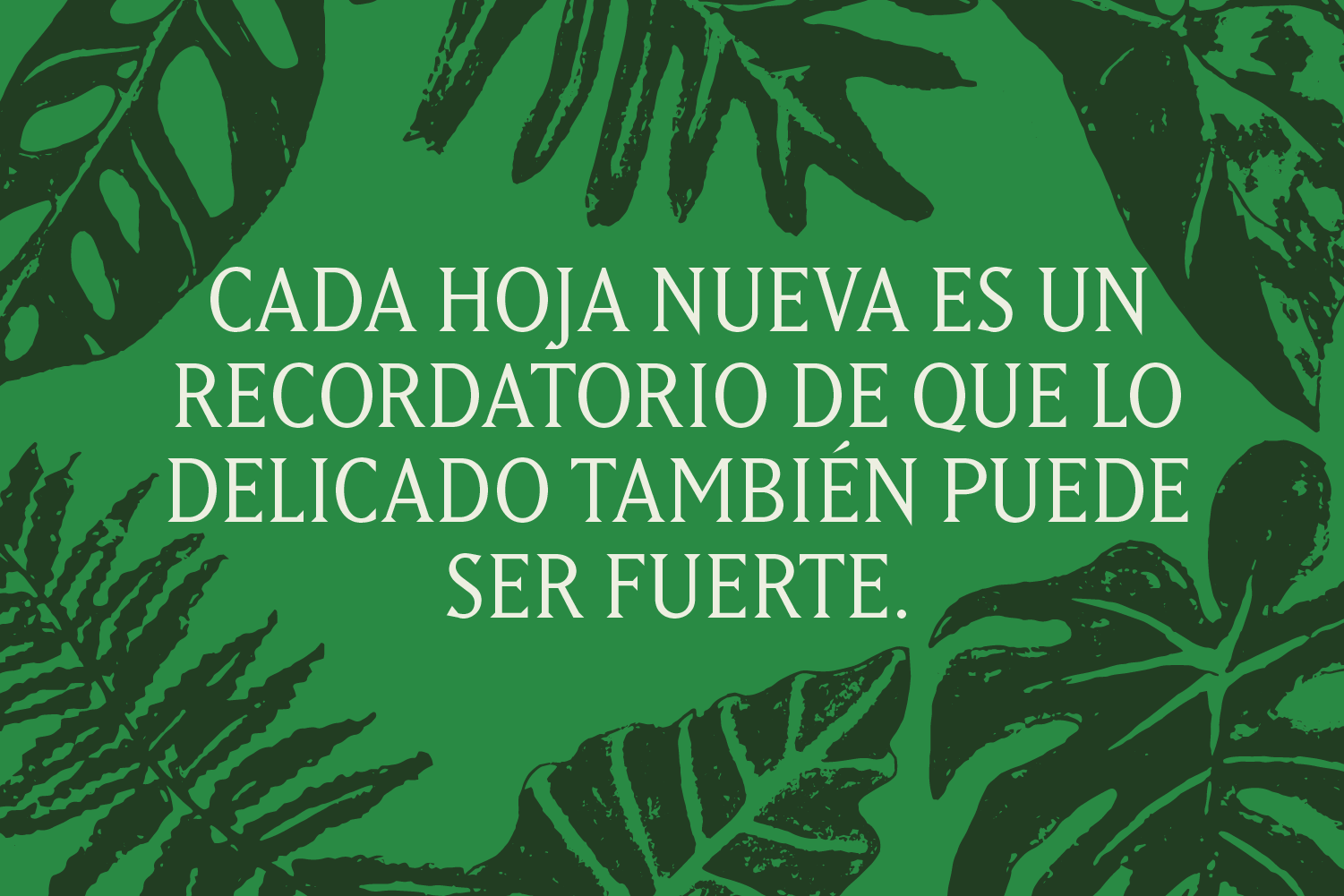
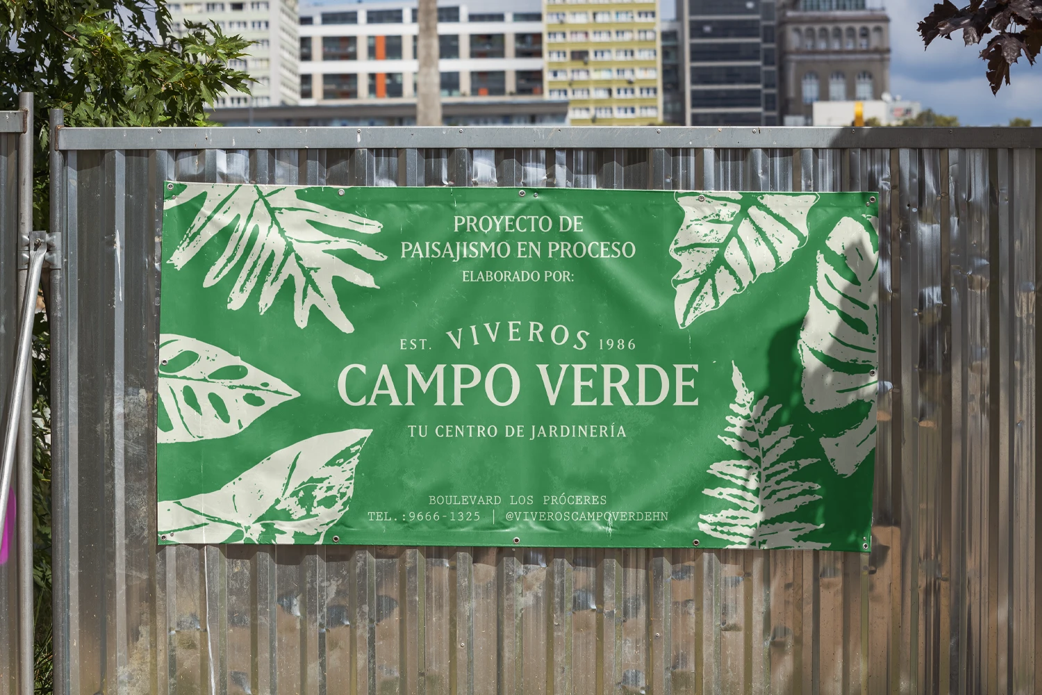
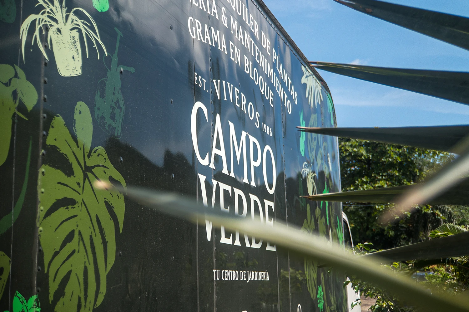
To reinforce the hands-on, all-in-one feeling, we created stamps inspired by common elements found in the nursery. These were hand-drawn and then digitized to preserve the handmade quality and textured feel.
To reinforce the hands-on, all-in-one feeling, we created stamps inspired by common elements found in the nursery. These were hand-drawn and then digitized to preserve the handmade quality and textured feel.

Project Information
It all started with grandma's garden and love for plants. Her family's suggestion to sell small plants and cuttings grew into what Viveros Campo Verde is today. From beautiful indoor and outdoor plants and flowers to gardening tools, and landscaping services, here you will find everything you need for your gardening needs. This nursery has been a family business since 1986.
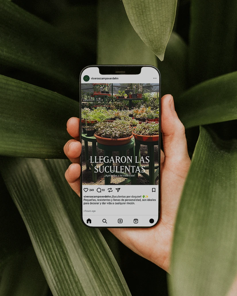
Challenge: Paola told us she wasn't happy with the logos she was using and wanted to be more active and organized on the nursery's social media. She also has two other brands that are derived from Viveros Campo Verde and she wanted them to be unified but with their individuality. She was looking for a refresh since the nursery keeps growing and she also has a lot of new ideas she would like to implement.
Solution: She mentioned that she likes that industrial look and since Campo Verde is the 'older sister' brand that has been active for so many years, we wanted this longevity to take part of the brand's image. We got our inspiration from industrial and old botanical designs found in gardens and museums. We used Matrix II as our main font to show off that old-school and stable feeling. We also kept the colors simple with a green monochromatic palette to highlight the brand's elements. We finished everything off with some monograms and showcased the rustic and handcrafted look with some handmade stamps to represent the nursery.
Project Playlist
Scan with the Spotify app or click for web player.
