Turning Clicks into Conversions
Client:
Camaleón
Services:
Web Design
Industry:
Digital Marketing
Year:
2022
Project Information
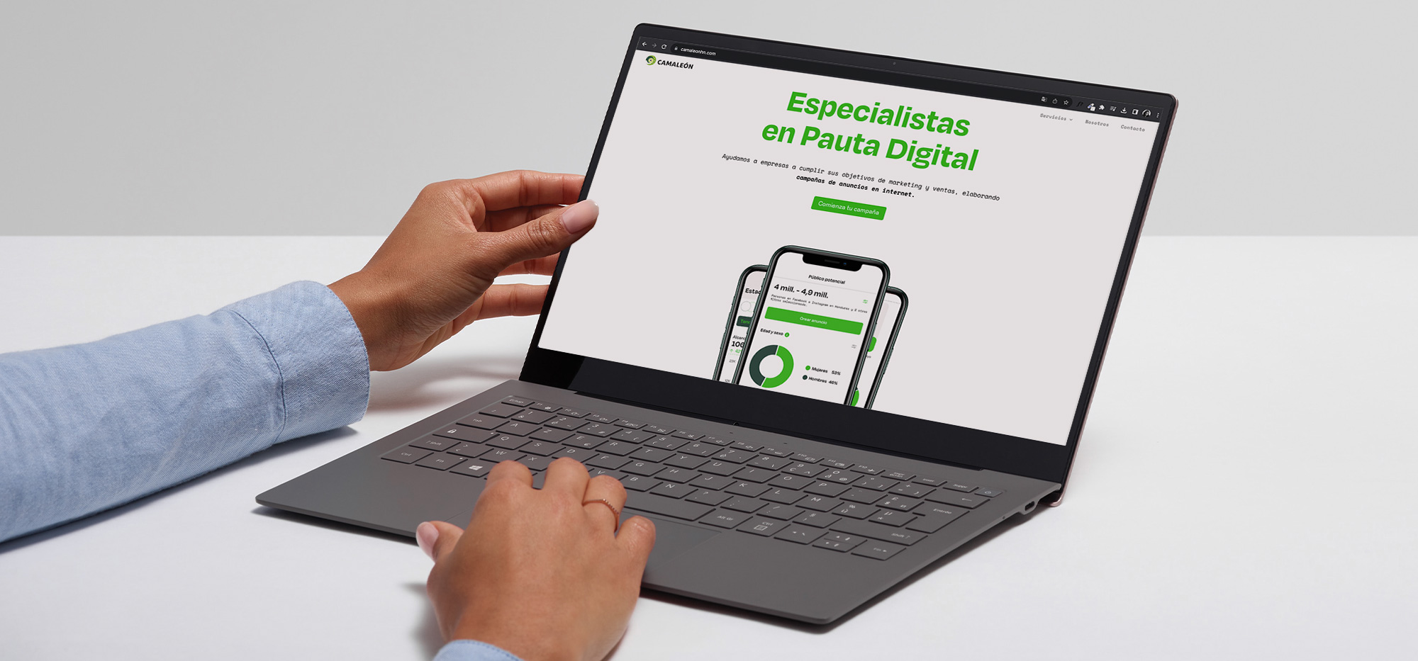
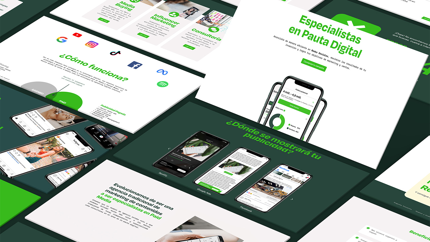
Social Media algorithms are always changing and companies struggle to know how to use social media to their advantage. Camaleón took this opportunity to transition from a social media management company to a paid social media and strategy company in Honduras. They have vast experience working with a variety of industries from food and drinks to health and education. With their new focus on only paid ad campaign strategy and influencer marketing, they knew they needed a new website that showed their clients exactly what they can do for them.
Challenge: We were eager to make this happen. They were looking to be positioned as the agency for strategy paid media and wanted to look more modern, upscale, and up to date. They also wanted their clients to be able to easily understand what they do and how to start.
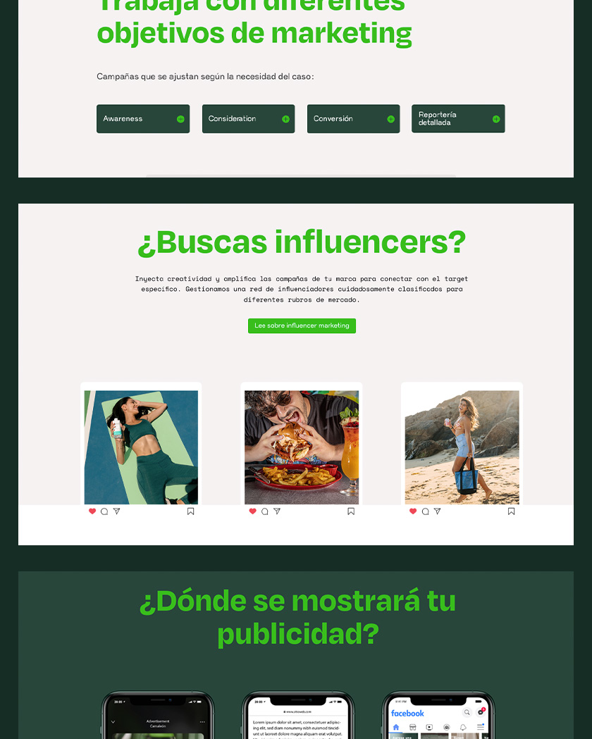
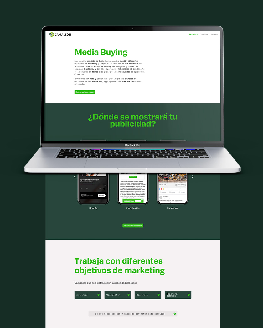
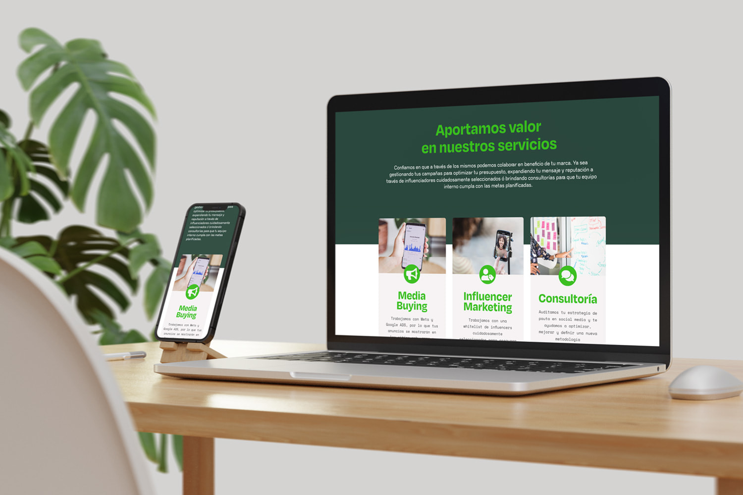
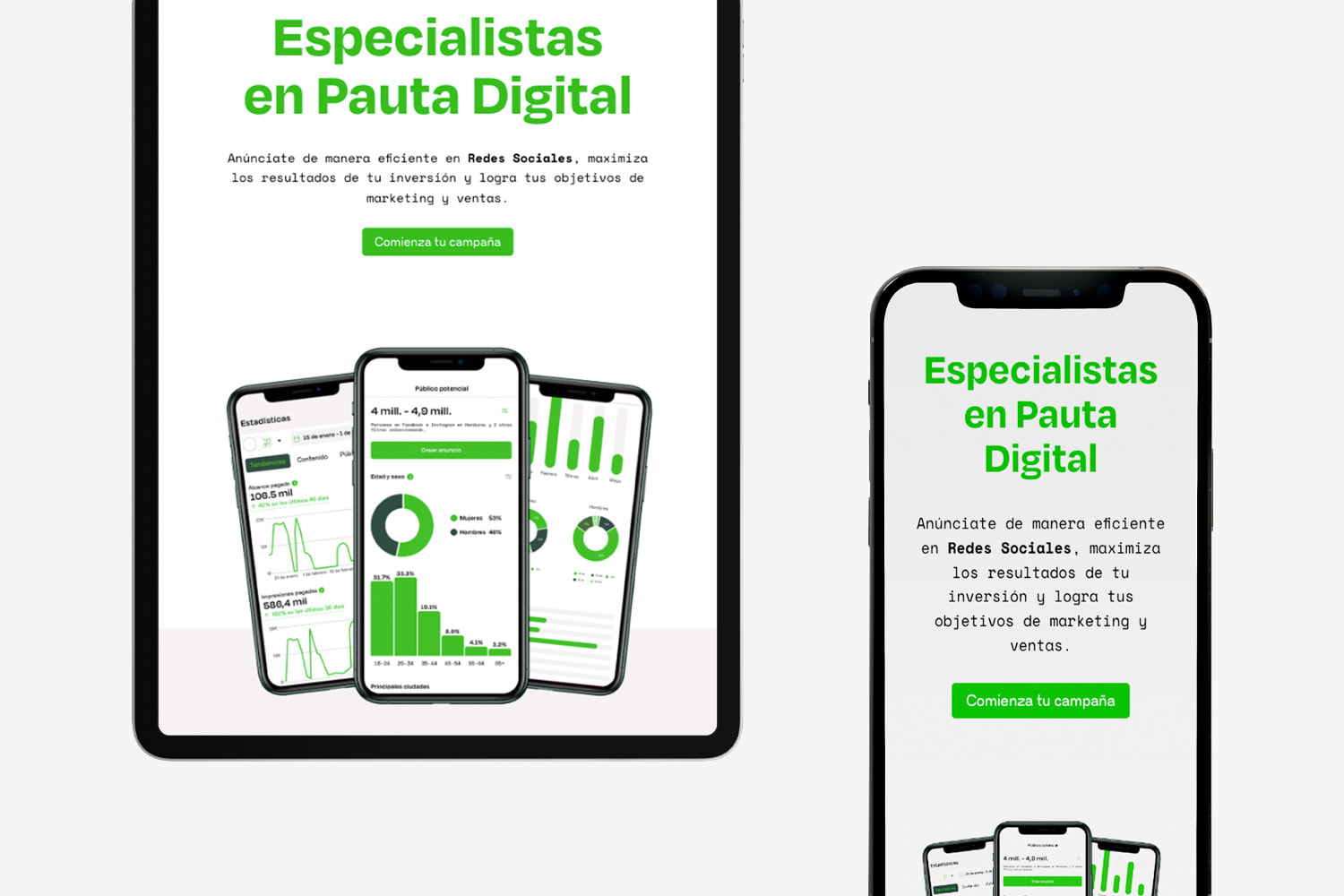
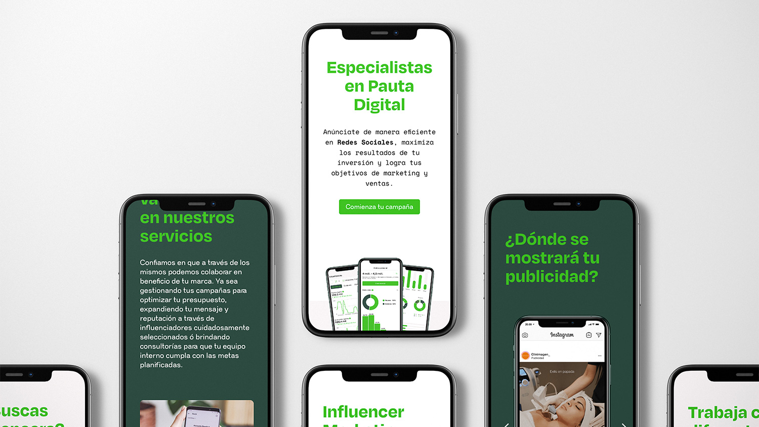
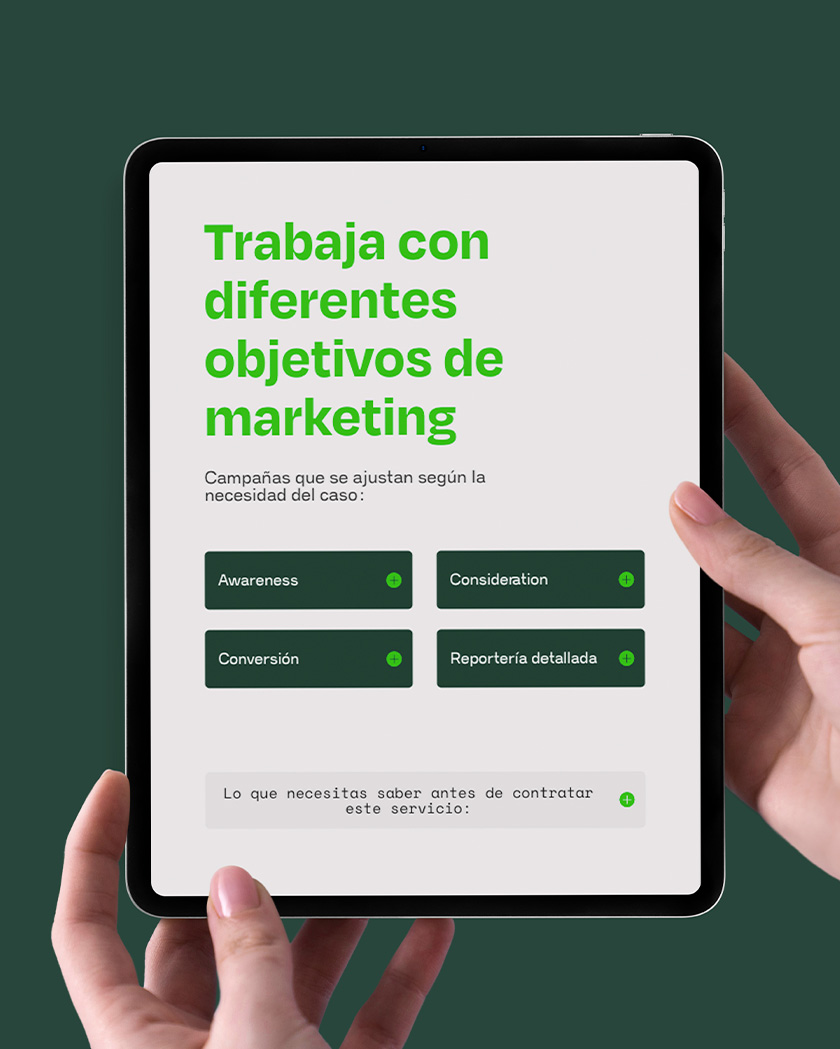
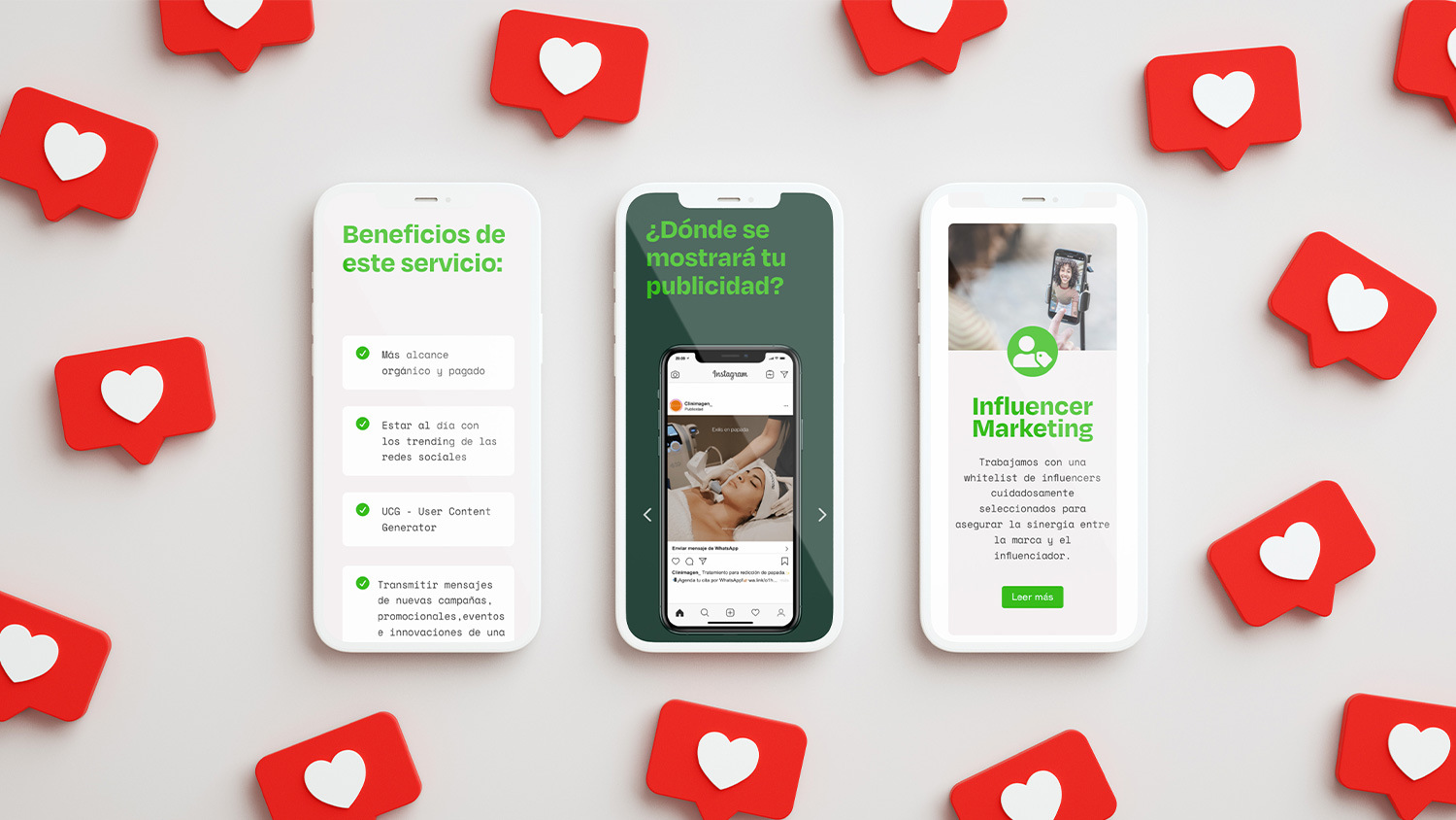
Solution: We put ourselves in the shoes of their clients and analyzed what they wanted to see. We focused on giving a clear message. To accomplish this, we planned a user journey that could help clients find the solution to their problems, and we displayed the information orderly and clear.
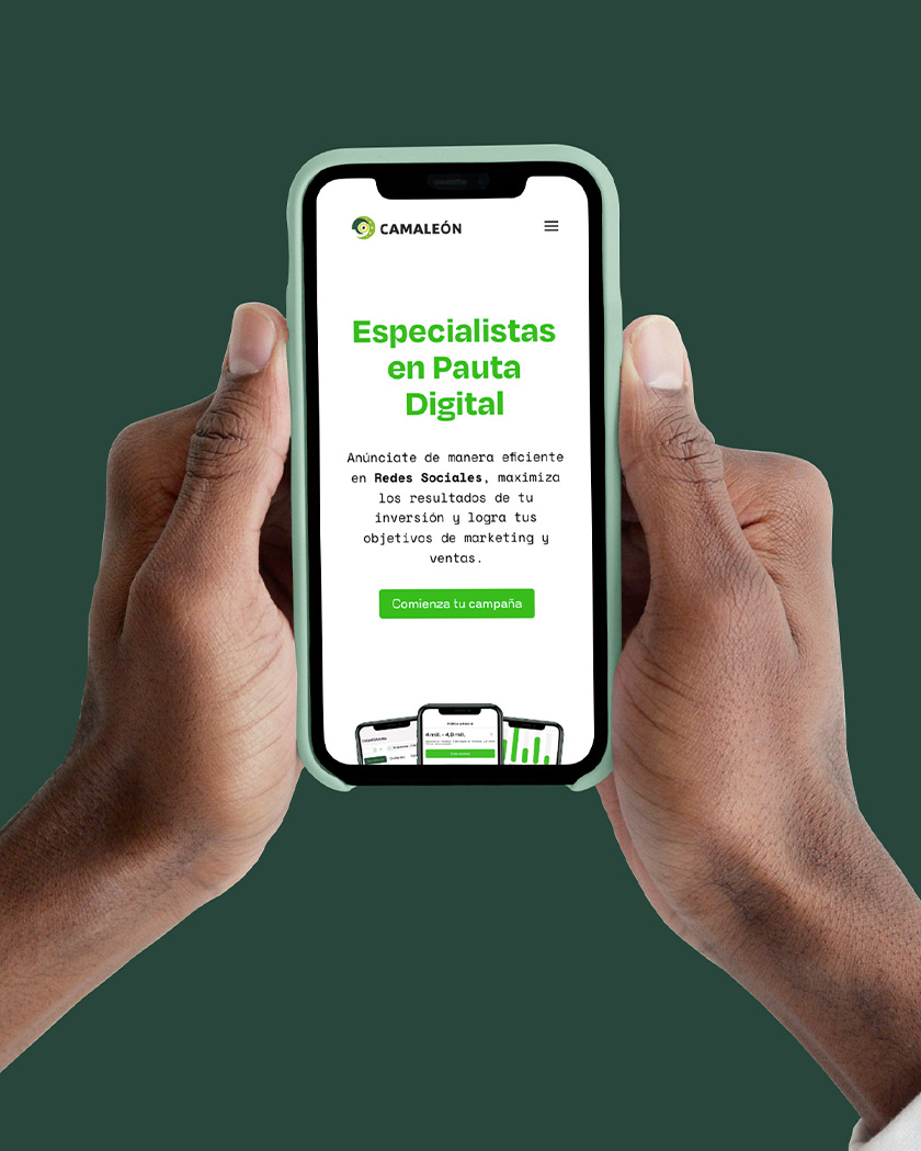
We made the website look attractive with the help of bright and deep green tones and clean backgrounds. We also opted for mono-serif fonts to give a modern, young, and digital feeling.
Client Feedback
I have known these artists for years, and I knew that our company’s website could not be in better hands.
The beauty of working with Mondos is that they support you with a very orderly logistics process at each stage and their creativity is at the level of the best branding agencies in the world, without a doubt.
norman, camaleón