
Hungry for More
A neighborhood gelato shop and café in Bed-Stuy, New York, serving handmade gelato, coffee, and comfort food with a playful twist.
Client—Brown Butter
Services—Branding
Industry—Food & Beverage
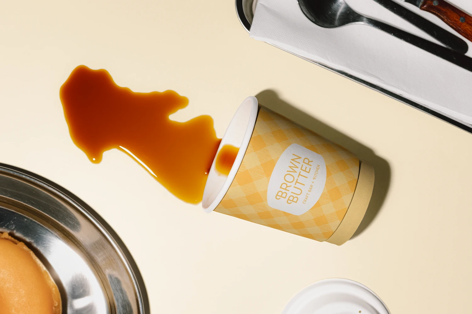
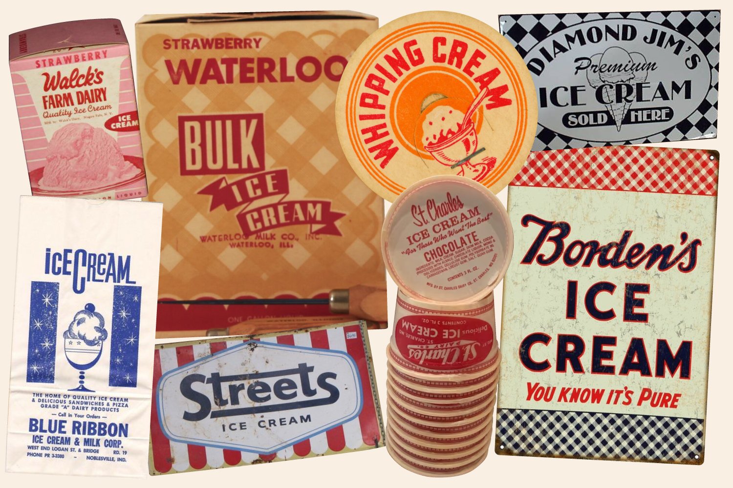
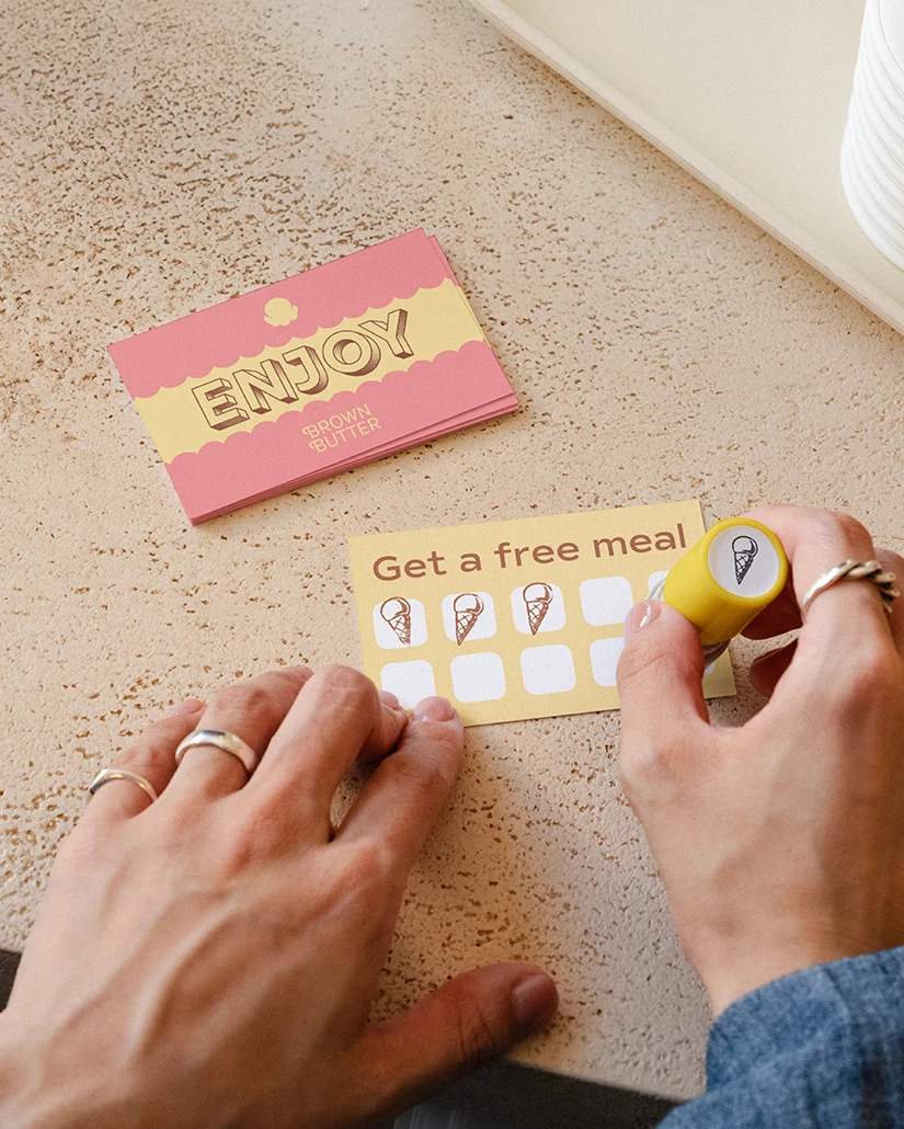
Classical ice cream packaging, signs, and shops were our inspiration, along with the textures, script lettering, and colors we associate with tasty delights.
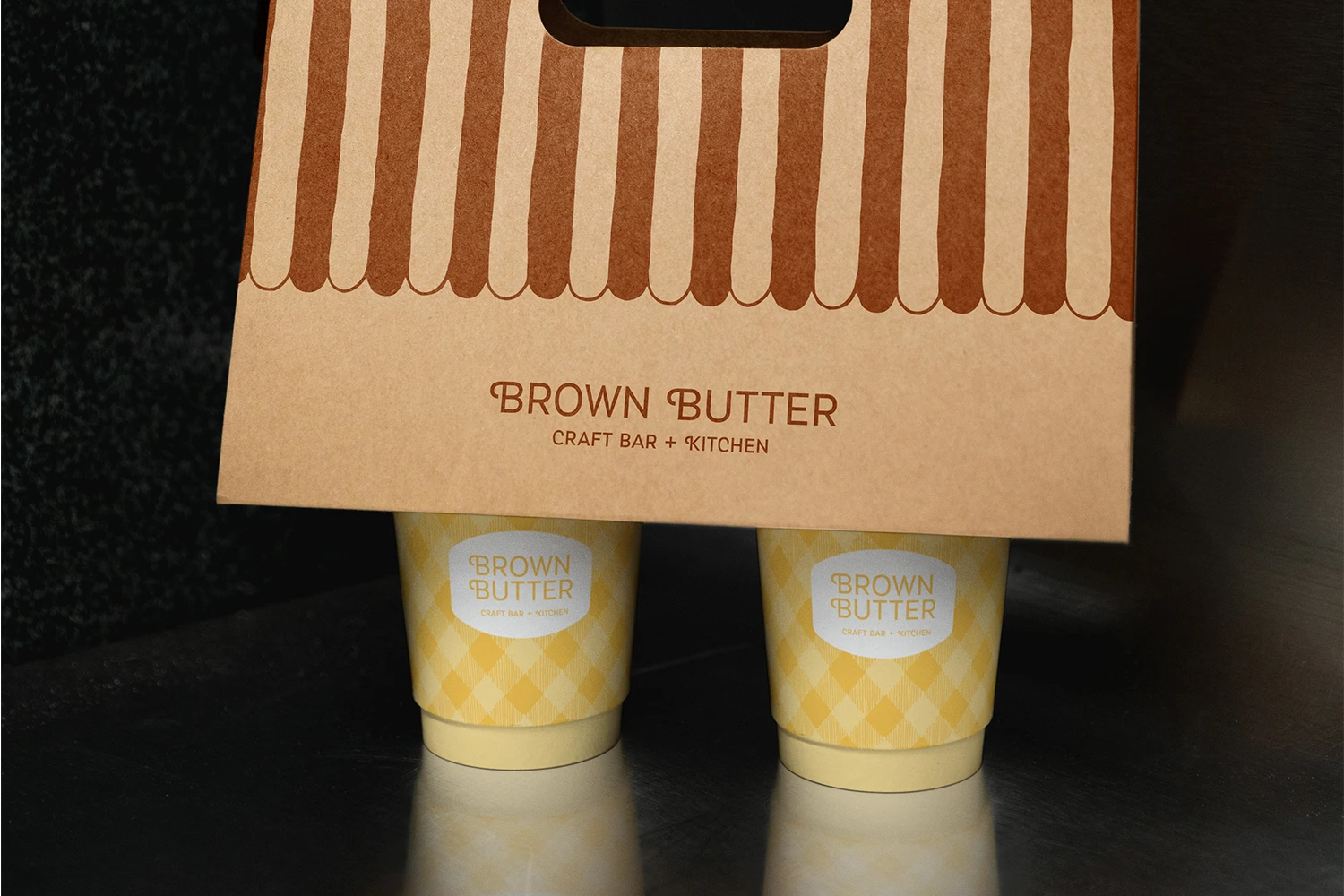
The patterns were drawn by hand to give the identity the same craft found in Brown Butter’s food.

The patterns were drawn by hand to give the identity the same craft found in Brown Butter’s food.
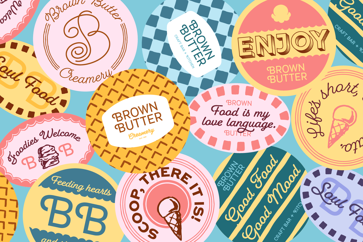
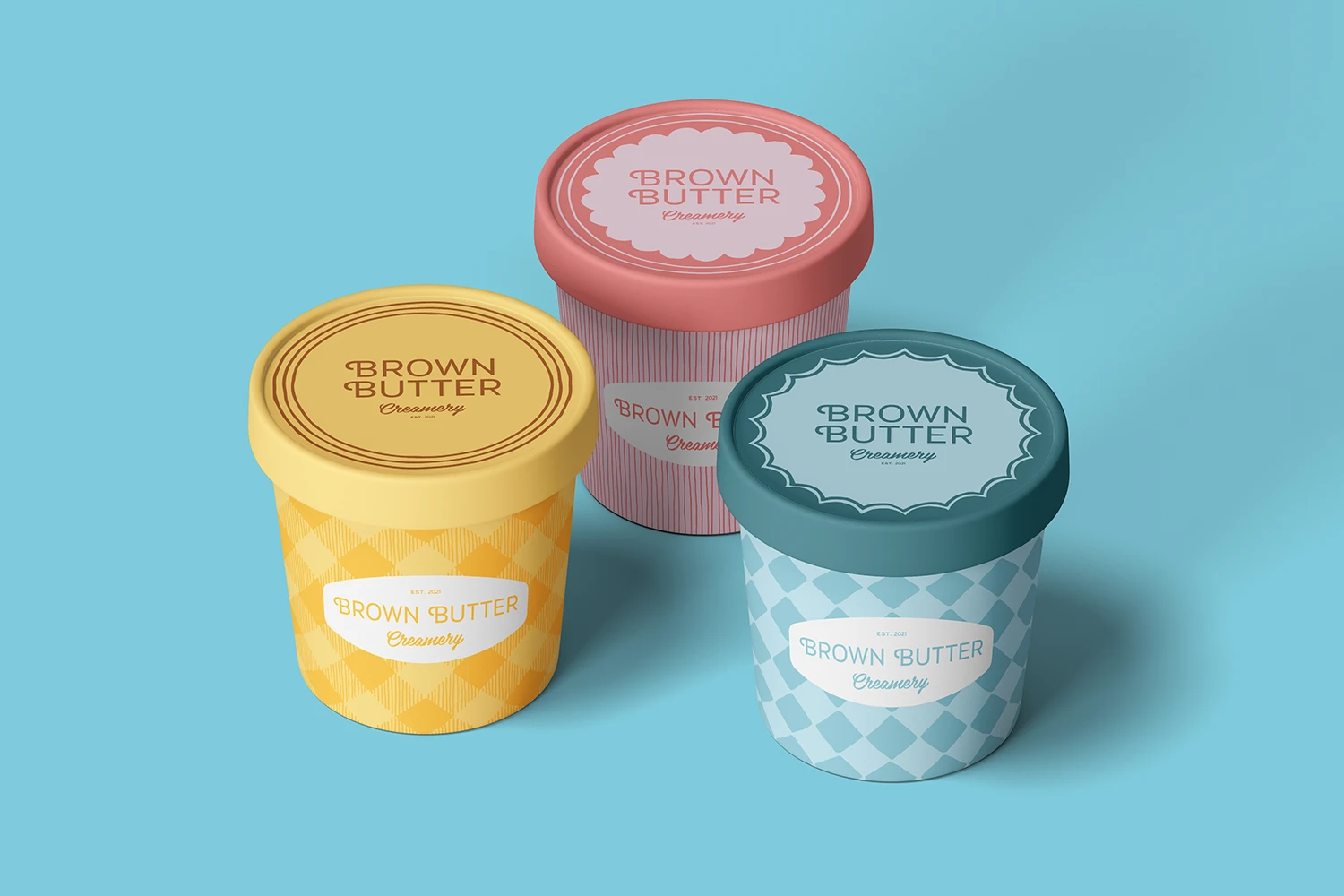
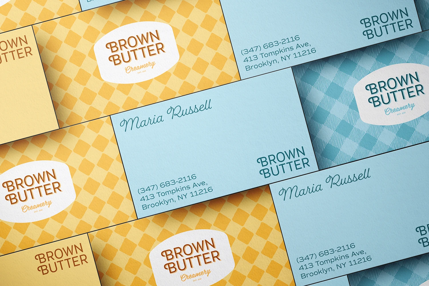
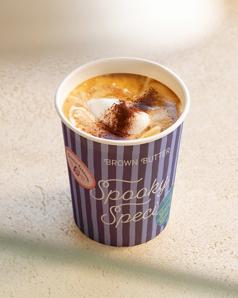
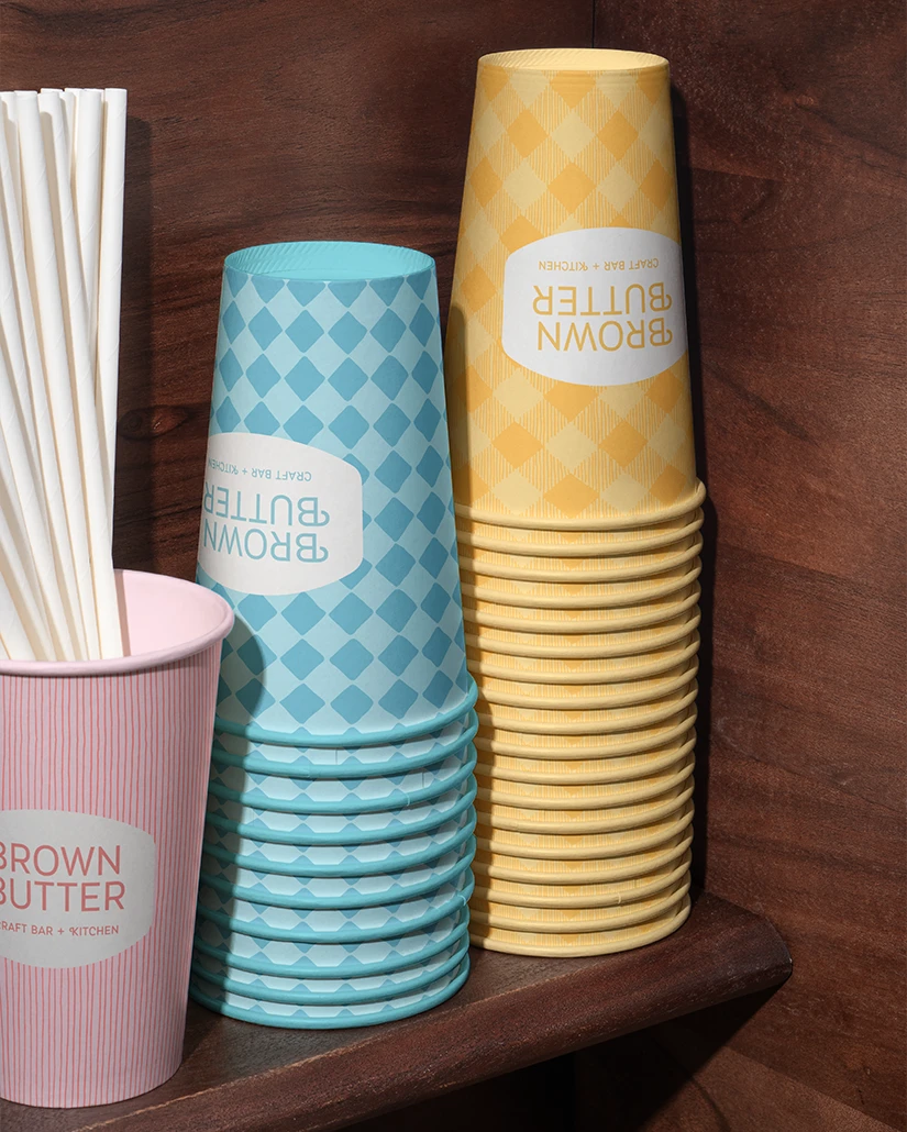
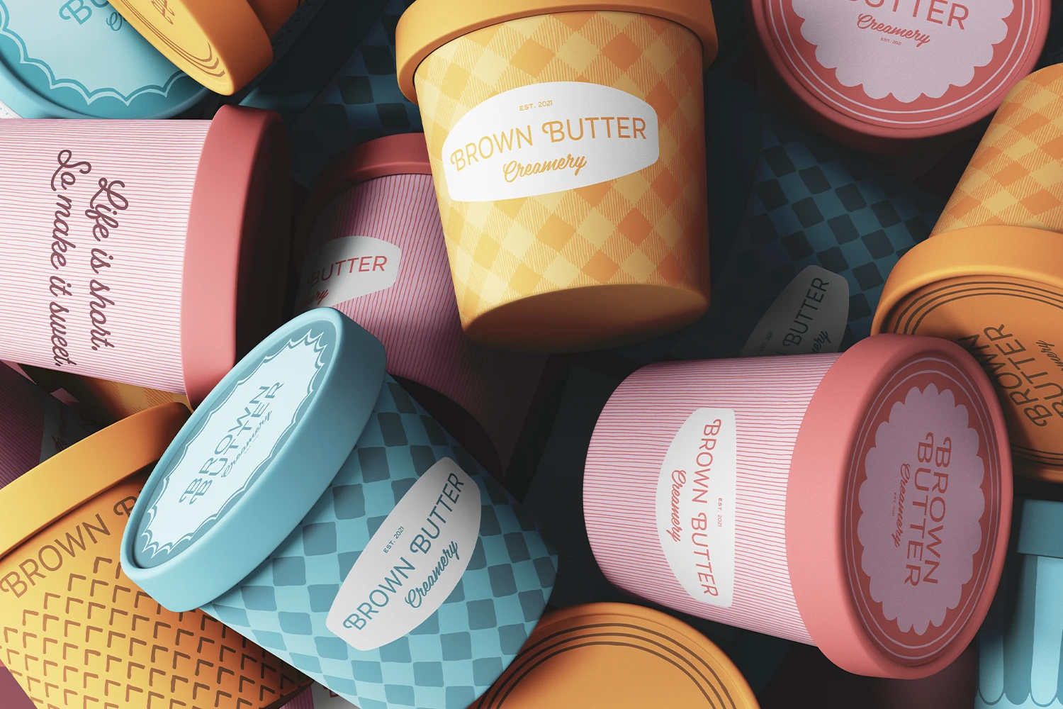
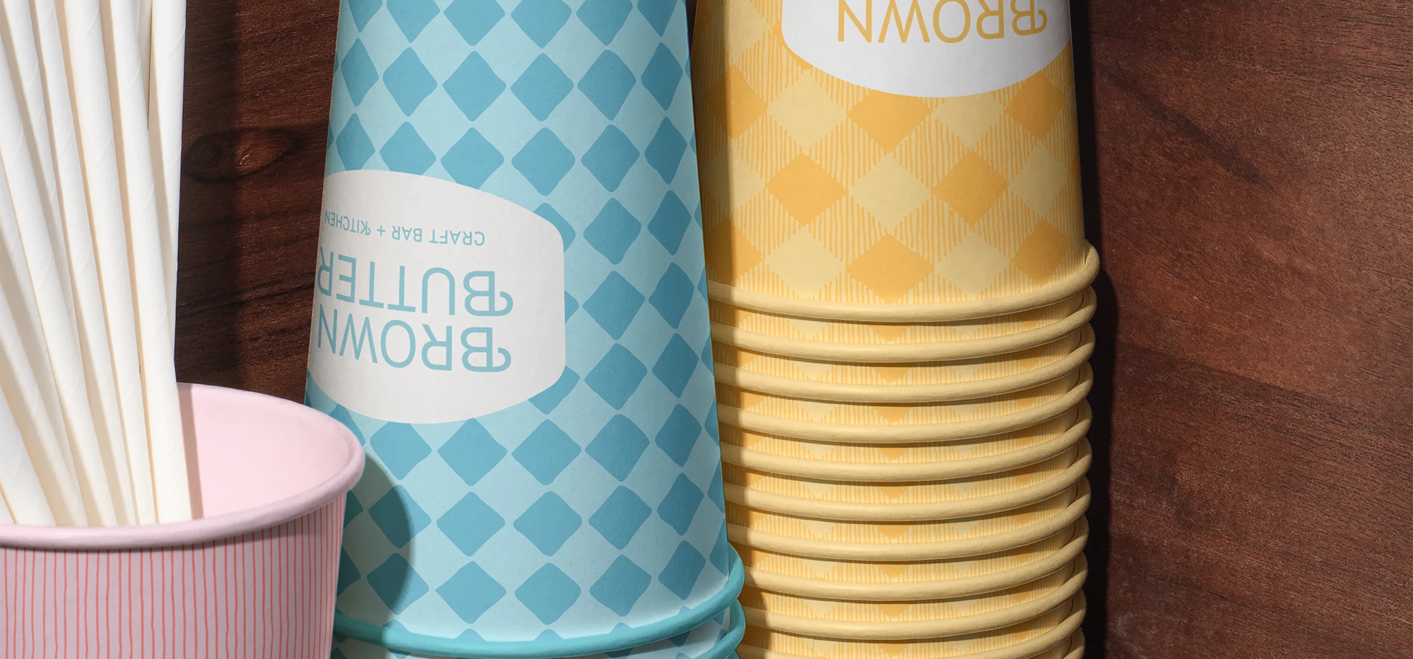
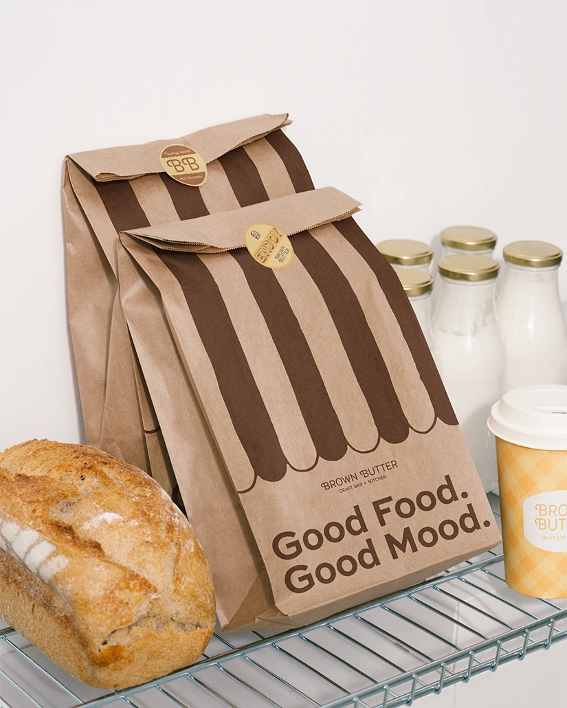
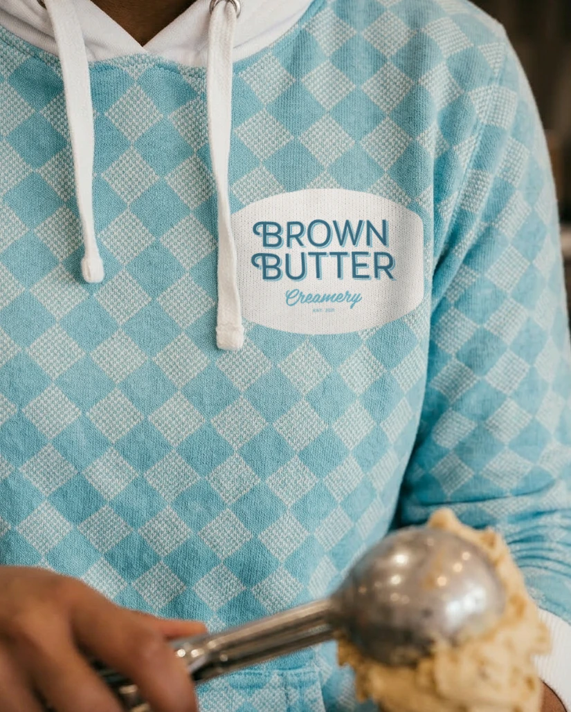
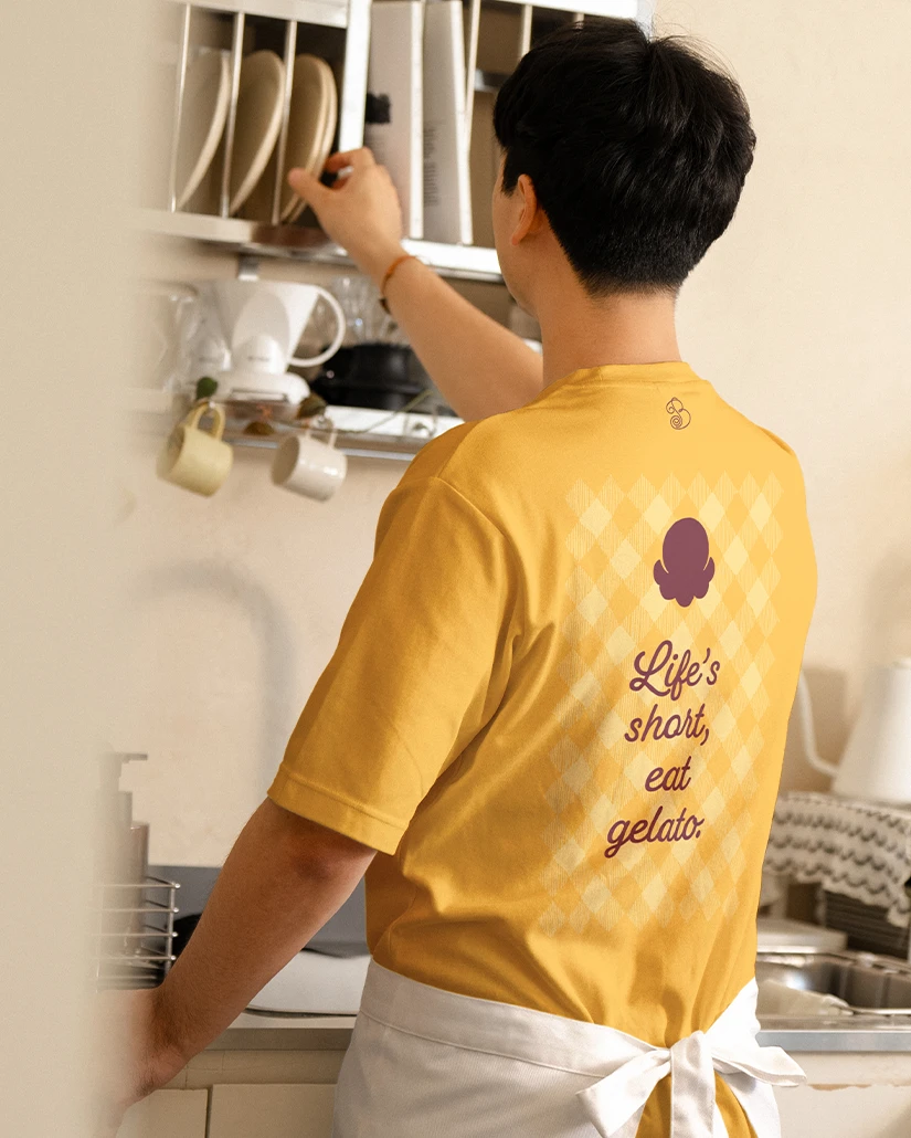
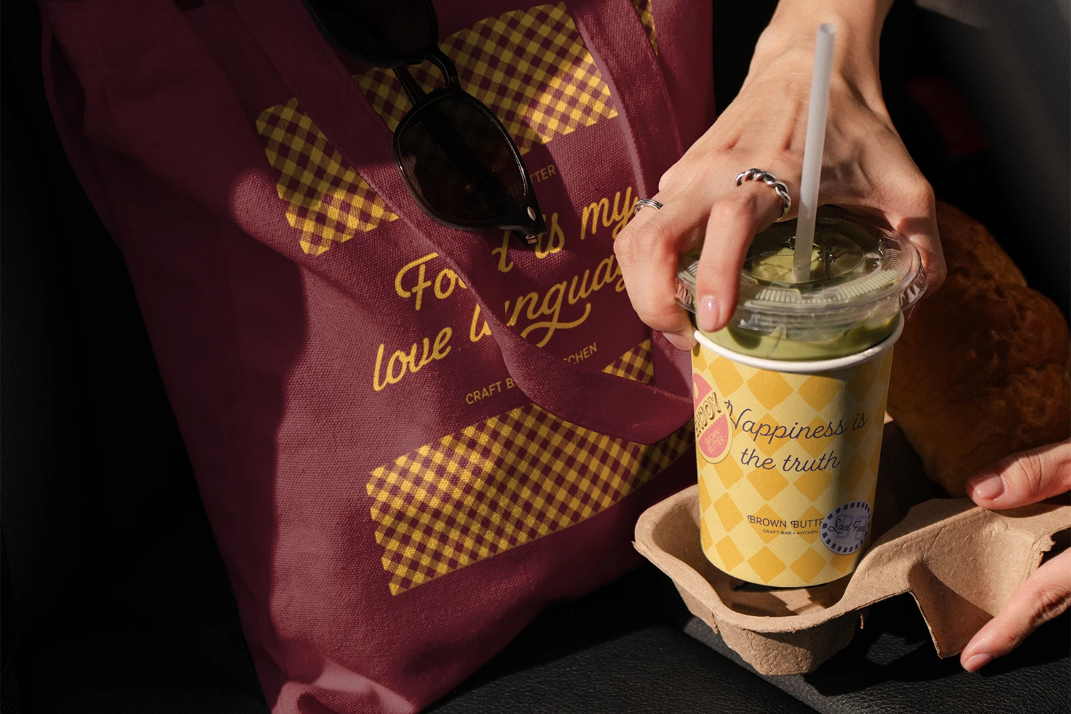
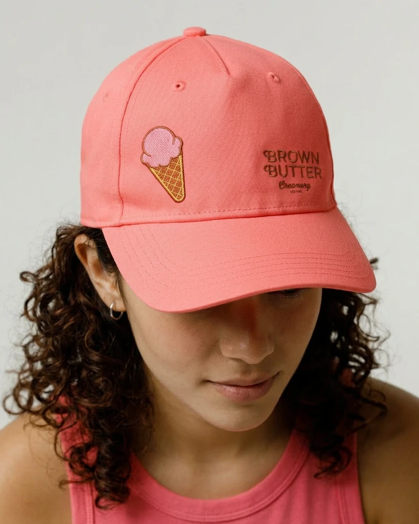
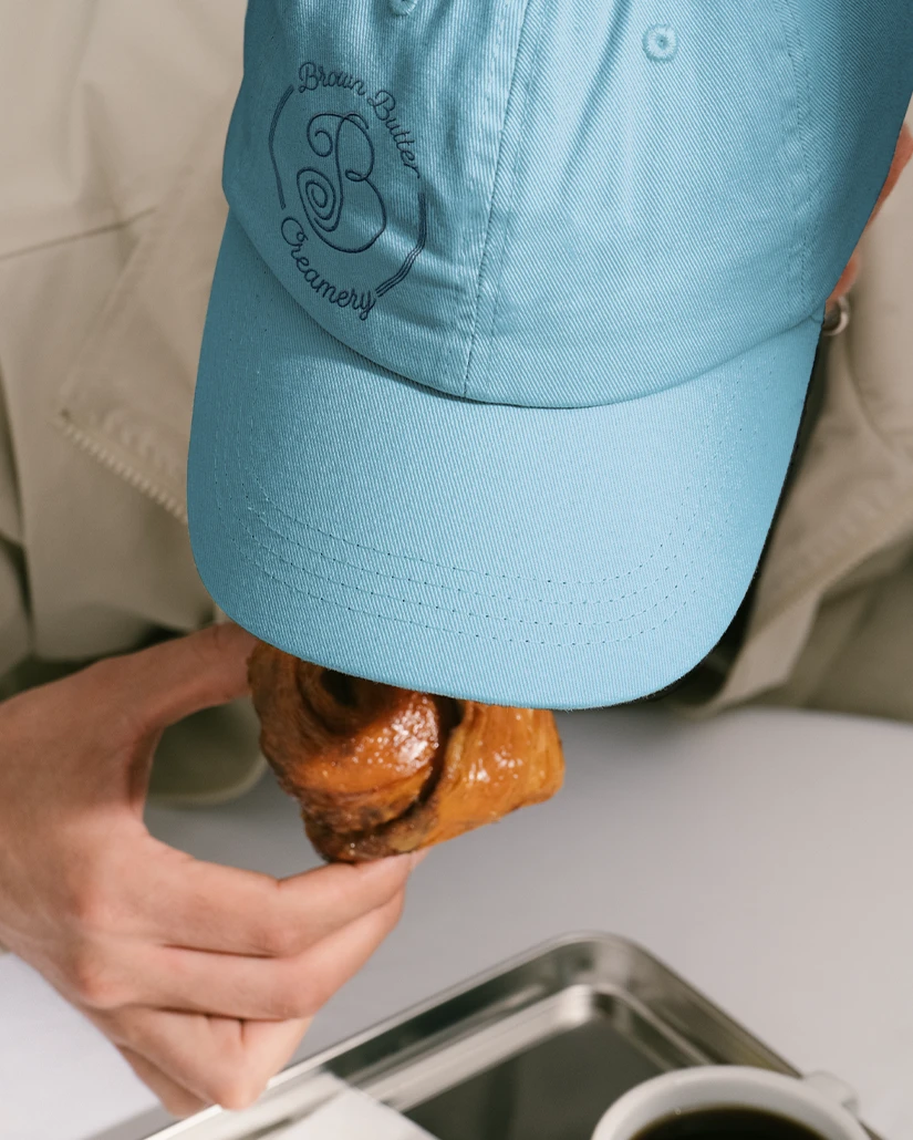
The patterns, colors, and typography come together to create an easy-to-use, rich system showing consistency across stickers, packages, and apparel.
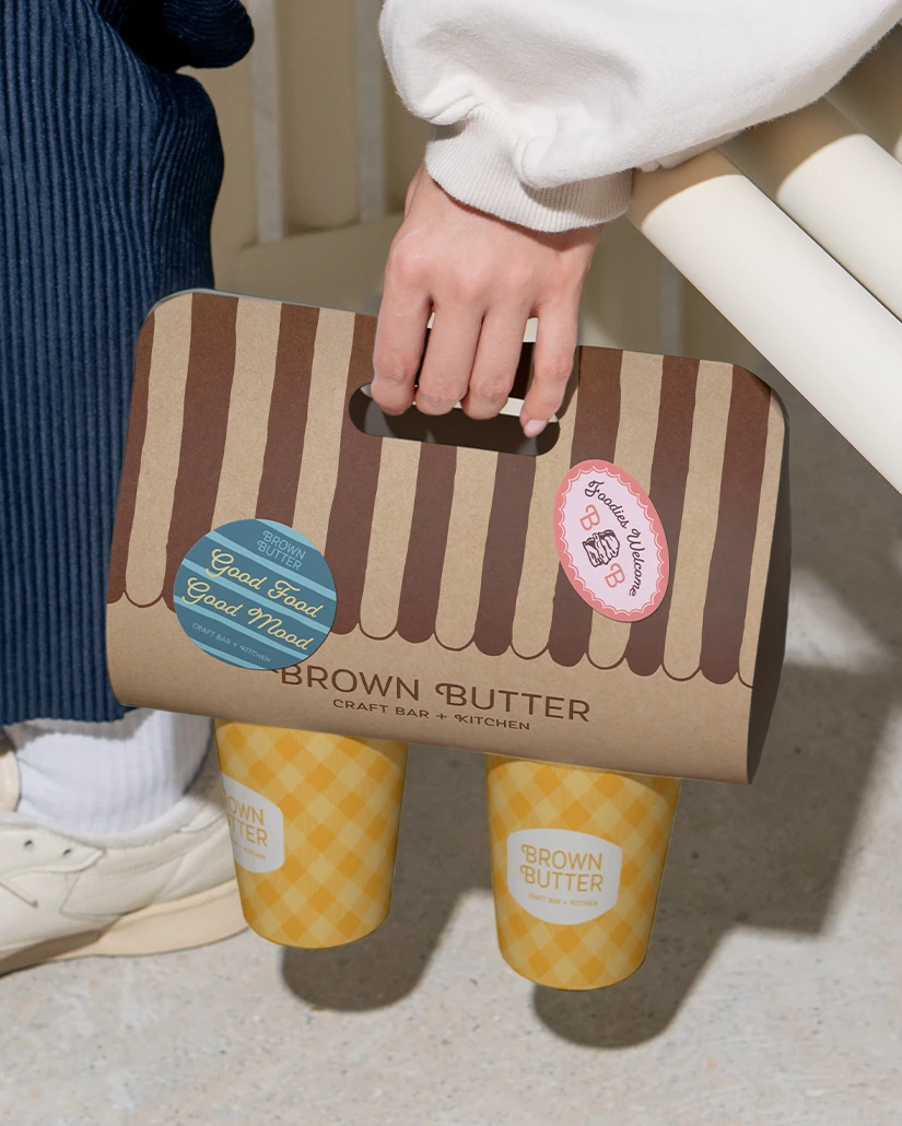
The patterns, colors, and typography come together to create an easy-to-use, rich system showing consistency across stickers, packages, and apparel.
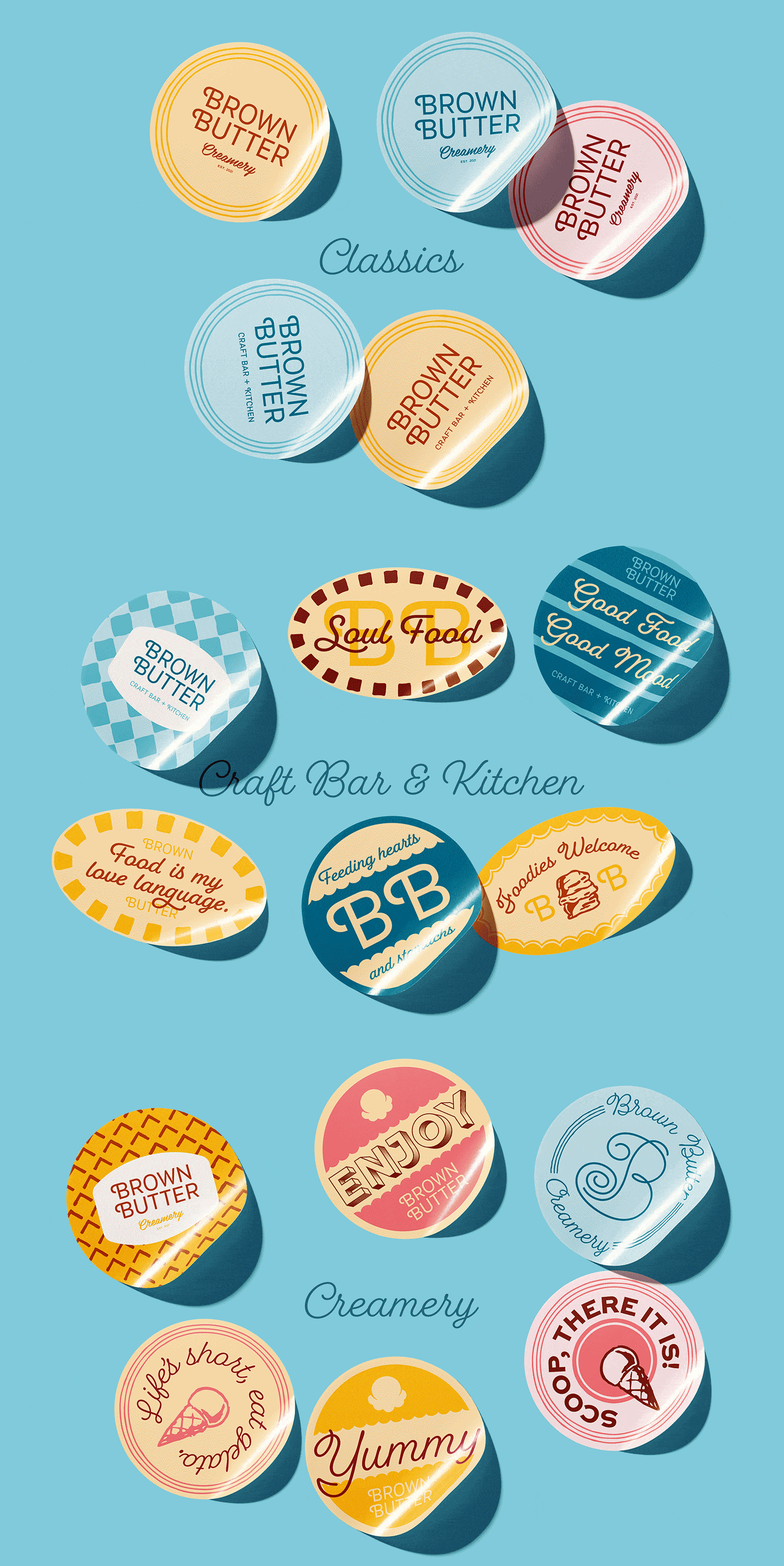
Project Information
Brown Butter Creamery is a gelato shop in the lovely neighborhood of Bed-Stuy, New York. They serve delicious flavors like chocolate hazelnut, pistachio, and bourbon vanilla. Their other location is Brown Butter Craft Bar & Kitchen, where they serve savory biscuits and coffee. Brown Butter’s comfort food has become a local favorite and a must-go-to spot in Bed-Stuy. But don’t just take our word for it; Brown Butter was featured in the NY Times’ list of the best ice cream shops in New York City. We came in at a point where the business was growing, but the brand hadn’t caught up.
The Challenge:
When Myriam came to us, Brown Butter already had a logo and a brand color, but not much else. As the shops grew in popularity, the brand needed more than a logo. It needed a visual identity that could keep everything feeling like Brown Butter, whether it was on a gelato cup, a menu, a sign, or something completely new.
The goal wasn’t to start from scratch. Myriam had already invested in signage and was happy with the logo. We needed to build around it and give the brand some room to grow.
The Solution:
In our strategy meeting, it became clear that an identity rooted in nostalgia was the best direction. Brown Butter’s customers grew up in the 80s and 90s, so we saw an opportunity to tap into the warm familiarity of that time.
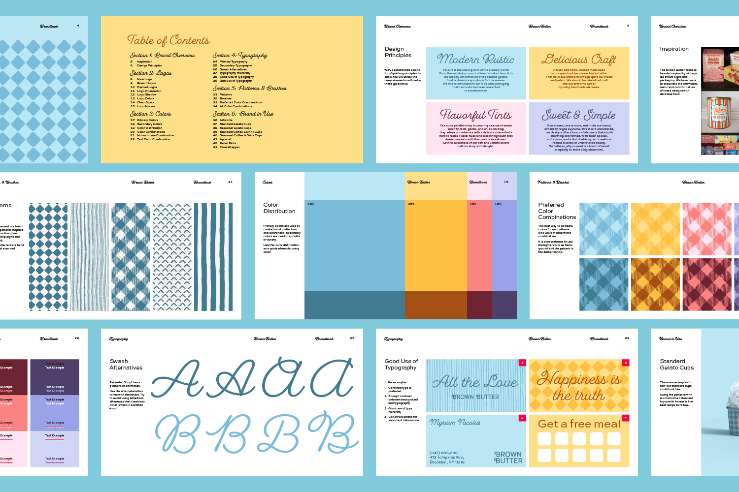
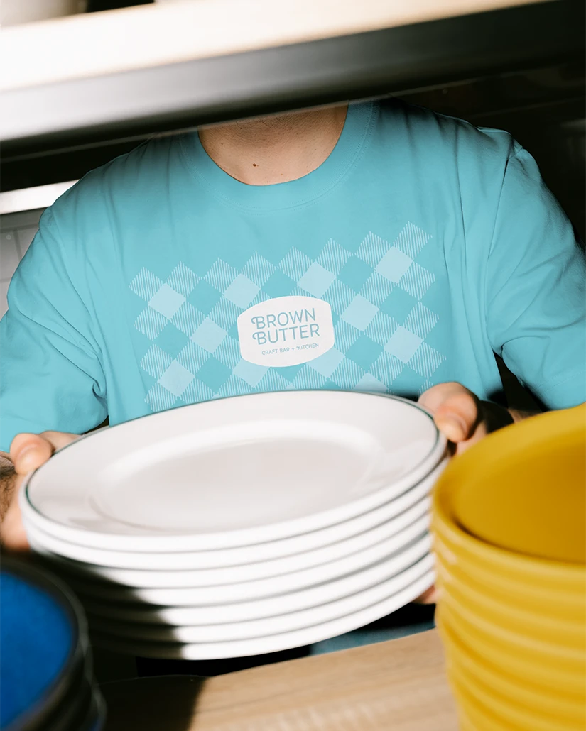
We looked at classical ice cream packaging, signs, and shops for inspiration. From that, patterns were drawn by hand to give the identity the same craft and personality found in Brown Butter’s food. The wide variety of patterns we created helps Brown Butter show consistency across packaging, signage, social media, menus, merchandise, etc.
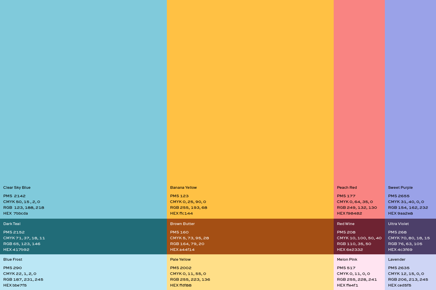
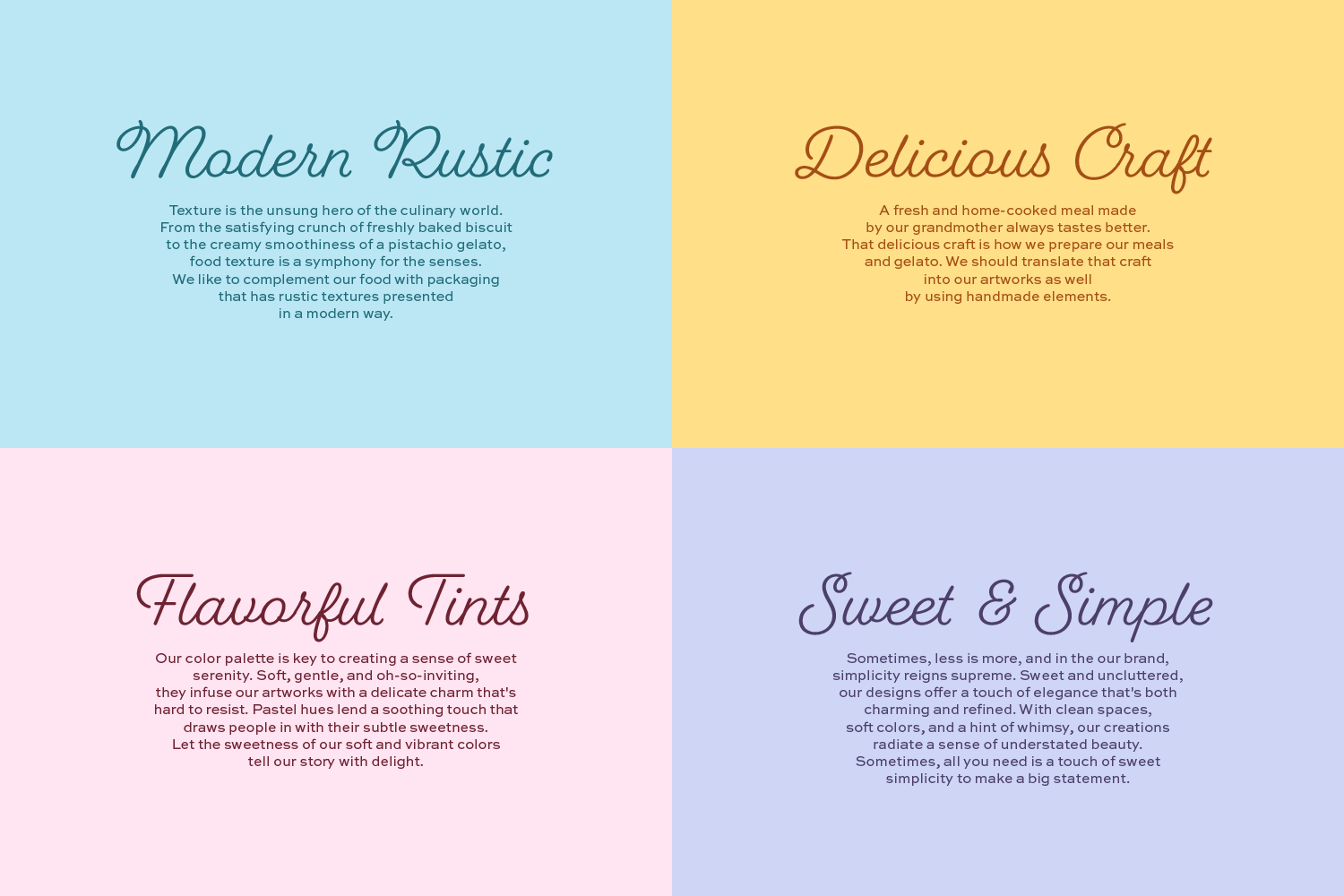
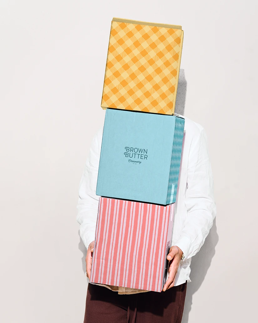
The flavorful colors of the gelato inspired the color palette. The sweet pastel colors tell Brown Butter's story with delight. Together, the colors and patterns create a simple system with variety to choose from. The brand can be consistent and leave room for the unexpected.
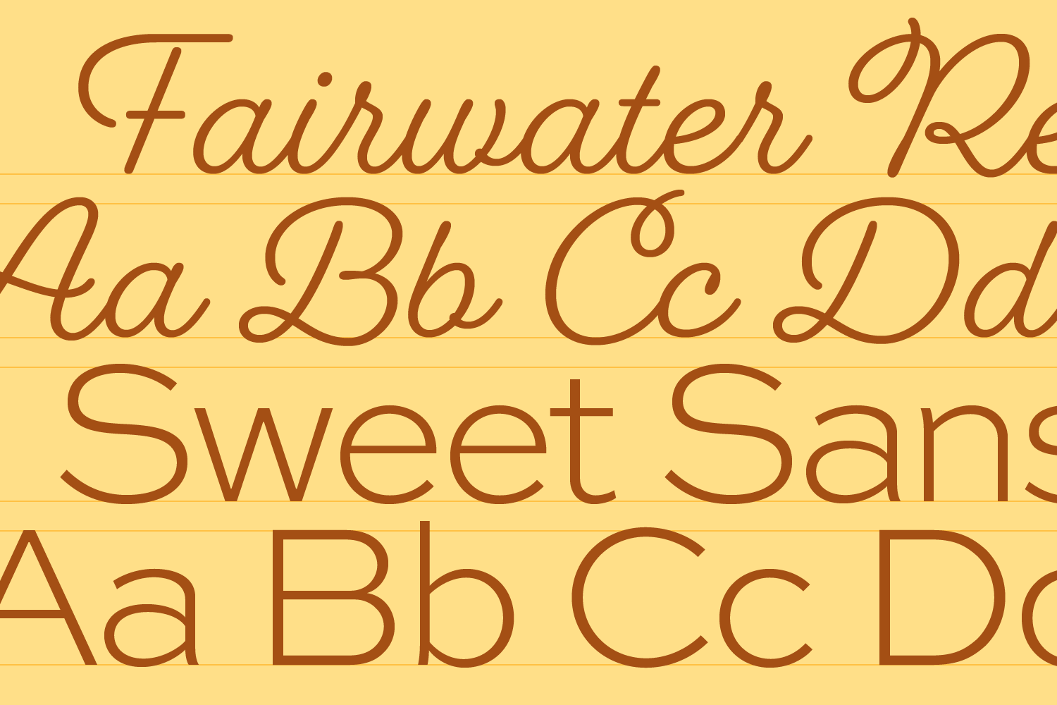
Fairwater script was chosen for the titles. Seeing “Caramel Cookie Crush” or “Chocolate Hazelnut” written in Fairwater’s whimsical loops feels as if it were designed for gelato names. Sweet Sans Pro plays the supporting role. It’s clean, functional, and easy to use, but still has enough personality to keep things from feeling too serious.
To incorporate the logo into the identity, we created a frame around it. It also comes in the new color palette.
Working with Myriam was a great. We’re happy to see Brown Butter continue to grow and even happier to have played a small part in its story. Now the brand feels much like the food itself: familiar, full of character, and a little unexpected.